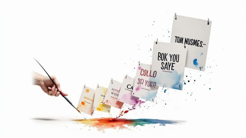
7 best fonts for posters: top picks
Discover the best fonts for posters and how to pick standout type for print. Top 7 picks and where to find them.
November 11, 2025•15 min read
Discover 8 striking black and white logos styles that prove bold contrast can elevate any brand. Find ideas, tips, and timeless design inspiration.

Instastock Team
November 12, 2025 • 14 min read
In a world saturated with vibrant hues, the simple elegance of a black and white logo stands out. Stripping a design down to its core elements, like shape, line, and contrast, is not a limitation; it is a mark of confidence. Black and white logos communicate clarity, sophistication, and a timeless quality that bypasses fleeting trends. They are versatile, memorable, and incredibly effective, ensuring your brand looks just as powerful on a business card as it does on a massive billboard.
However, creating an impactful monochrome logo requires more than just removing colour. It is about mastering specific design principles to forge a mark that is both simple and profound. A successful design relies on strong form and clear communication, making it a true test of a brand’s foundational identity.
In this guide, we will explore eight distinct styles of black and white logos, from minimalist geometry to clever negative space. We will break down the techniques, strengths, and strategic tips behind each one. Whether you are a designer seeking inspiration or a founder building a brand from scratch, you will discover actionable insights to help you craft a logo with lasting impact.
When you strip a design down to its core elements, you’re left with pure, unadulterated form. This is the magic behind minimalist geometric logos. This approach leverages fundamental shapes like circles, squares, and lines to build a visual identity that’s both incredibly simple and profoundly impactful. It’s a design philosophy that champions clarity over complexity, resulting in some of the most enduring black and white logos ever created.
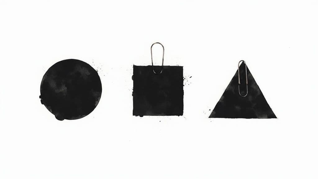
Think of the iconic Nike ‘Swoosh’ or the interlocking circles of Mastercard. In monochrome, these symbols don't lose their power; they gain an air of timeless elegance. Popularised by legends like Paul Rand, the geometric style is built on the principle that a logo must be recognisable even at a glance. It’s perfect for brands aiming for a modern, sophisticated, and clean aesthetic that works flawlessly across any medium, from a giant billboard to a tiny app icon.
Ready to embrace geometric simplicity? Here are some practical tips to guide your design process:
By focusing on these core principles, you can create a logo that is not only beautiful but also incredibly functional. Once your design is finalised, you can see how it performs in real-world scenarios by learning how to create mockups that bring your vision to life.
Some of the most powerful logos rely on a single, instantly recognisable outline. This is the core principle of the iconic silhouette style, an approach that strips away all internal detail to communicate a message through pure form. Because the human brain processes shapes incredibly quickly, a well-designed silhouette can create a lasting impression in a fraction of a second, making it a formidable tool for brand identity.

Think of the leaping cat of Puma or the classic Penguin Books logo. In monochrome, these silhouettes don't just survive; they thrive. The absence of colour forces the viewer to focus entirely on the shape, reinforcing its symbolic power. This technique, popularised by modern sporting brands and design movements like Art Deco, is perfect for brands wanting to convey a clear, singular idea with confidence and elegance. These black and white logos are timeless because they connect with us on a fundamental, almost primal, level.
Want to capture the power of a silhouette? Here are some tips to help you craft a memorable outline:
There's a reason why monograms feel so personal and luxurious; they are the typographic signature of a brand. This style transforms initials or letterforms into a single, cohesive symbol. By interlocking, overlapping, or creatively merging letters, this approach creates a distinctive mark that is both elegant and highly memorable. It’s a classic technique that communicates heritage and sophistication, making it a perfect candidate for striking black and white logos.
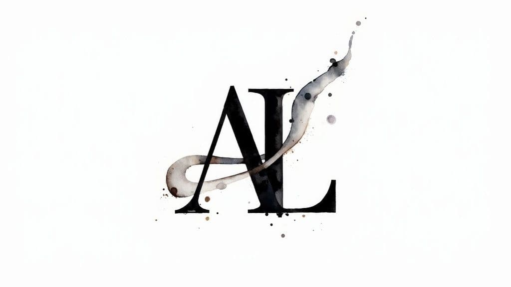
Popularised by high-fashion houses like Chanel (CC) and Louis Vuitton (LV), the monogram is a powerful tool for building brand identity. In a simple monochrome palette, the focus shifts entirely to the artistry of the letterforms and their interaction. This style is exceptionally effective for brands in luxury, fashion, and professional services, as it conveys a sense of bespoke quality and established authority. The design itself becomes an exclusive emblem of the brand’s identity.
Ready to craft a monogram that speaks volumes? Here are some practical tips to guide your design process:
Where geometric logos find beauty in precision, illustrative line art logos celebrate the human touch. This style uses continuous or carefully drawn lines to create artistic, hand-crafted marks that feel personal and bespoke. It’s a design approach that channels the spirit of an artist’s sketchbook, conveying creativity, authenticity, and a deep sense of craftsmanship, making it a perfect candidate for stunning black and white logos.

Think of the detailed early versions of the Starbucks siren or the beautiful botanical emblems seen on artisanal gin bottles. These logos tell a story through their lines. In monochrome, the focus is entirely on the quality and character of the illustration itself. Popularised by craft brands and the modern independent design movement, this style is ideal for businesses that want to highlight their organic, artisanal, or creative nature. It feels approachable and unique, standing out from more corporate, geometric designs.
Ready to give your brand an artistic, handcrafted feel? Here are some practical tips for creating an illustrative line art logo:
Where some logos depict a recognisable object, the abstract symbol carves its own path. This approach uses non-representational shapes and forms to build a visual identity that is entirely unique to the brand. Instead of showing what a company does, an abstract logo evokes a feeling, a concept, or a core value, creating a powerful and memorable brand mark. It’s a sophisticated style that relies on form and balance to communicate its message, making it a perfect candidate for striking black and white logos.
Think of the iconic Adidas three stripes or the dynamic Pinterest ‘P’. In monochrome, these symbols become even more potent, their forms standing out without the distraction of colour. Popularised by corporate design consultancies like Pentagram and Landor, this style is favoured by tech giants and Fortune 500 companies aiming to build a global brand identity that transcends language and culture. The abstract mark becomes a vessel for the brand’s story, gaining meaning over time through association.
Ready to create a symbol with lasting impact? Here are some practical tips to guide your design process:
By focusing on a strong concept, you can create a logo that is both visually compelling and deeply meaningful. You can further enhance this style by pairing it with the right visual elements, so why not explore how to use a black and white abstract background to complement your new brand mark.
Sometimes, the most powerful visual element a brand has is its own name. The typographic wordmark embraces this, turning the company name itself into a distinctive logo. This approach relies entirely on the art of typography - the careful selection, customisation, and arrangement of letterforms - to create a visual identity that is both direct and memorable. It’s a design style that says, “Our name is our brand,” with confidence and clarity.
Think of iconic brands like Google, Coca-Cola, or Microsoft. Their names, rendered in unique typefaces, have become globally recognised symbols. In a monochrome palette, these black and white logos shine, as the focus shifts entirely to the character and personality of the letterforms. This style is incredibly effective for brands with short, catchy names, allowing them to build strong name recognition from day one. It’s a favourite among tech companies, fashion labels, and modern brands that value a clean, minimalist aesthetic.
Ready to let your name do the talking? Here are some practical tips to guide your design process:
Once you’ve perfected your wordmark, it's vital to document its usage to maintain consistency. You can ensure everyone uses it correctly by creating clear brand guidelines for your team.
Emblems and badges are classic logo styles that convey a sense of tradition, authority, and belonging. This approach combines text, imagery, and decorative elements within a contained shape like a shield, circle, or crest. By enclosing all components within a unified border, these logos create a compact and official-looking seal that feels established and trustworthy. It's a style deeply rooted in history, evoking the legacy of university seals and classic sports franchises.
Think of the iconic Harley-Davidson bar and shield or the Guinness harp. In monochrome, the intricate details of an emblem are brought to the forefront, highlighting the craftsmanship of the design. Stripping away colour focuses the viewer’s attention on the lines, shapes, and texture, reinforcing the logo's traditional and authoritative feel. This makes it an excellent choice for black and white logos intended to project stability and prestige for universities, heritage brands, and established organisations.
Ready to craft a logo with lasting impact? Here are some practical tips for designing a compelling emblem:
What if the most important part of your logo was the space you left blank? That’s the genius behind the negative space approach. This design style uses the empty or ‘negative’ space within or around a subject to create a second, often hidden, image. It's an elegant trick of the eye that transforms a simple design into a multi-layered story, creating a memorable ‘aha’ moment for the viewer.
Think of the iconic FedEx logo and the hidden arrow between the 'E' and 'x', or the World Wildlife Fund panda, where the animal is formed almost entirely by negative space. These black and white logos are celebrated not just for their simplicity, but for their intelligence. In monochrome, the contrast is heightened, making the interplay between positive and negative space even more dramatic and effective. It's a hallmark of a brand that values subtlety and rewards a closer look.
Ready to add a layer of intrigue to your design? Here’s how to master negative space:
| Style | 🔄 Implementation Complexity | ⚡ Resource Requirements | ⭐ Expected Effectiveness | 📊 Typical Outcomes / Impact | 💡 Ideal Use Cases |
|---|---|---|---|---|---|
| Minimalist Geometric Logo Style | Medium 🔄 (precision, strong grid) | Medium ⚡ (skilled designer; low production cost) | ⭐⭐⭐⭐ — clear, scalable | Timeless, highly legible; excellent reproduction | Corporate/tech, product marks, single-color needs |
| Iconic Silhouette Logo Style | Low–Medium 🔄 (shape clarity critical) | Low ⚡ (simple to produce; needs distinctive silhouette) | ⭐⭐⭐⭐ — instant recognition | High visual impact; great at small sizes and signage | Sportswear, mascots, app icons, stamps |
| Monogram and Letter-Based Logo Style | High 🔄 (custom lettering, balance) | Medium ⚡ (typography skill; iterations) | ⭐⭐⭐ — elegant, personalized | Compact, professional identity; best with supporting system | Luxury brands, law firms, personal brands |
| Line Art and Illustration Logo Style | High 🔄 (consistent line work, detail) | High ⚡ (illustrator expertise; reproduction specs) | ⭐⭐⭐ — distinctive, artisanal | Narrative-rich, warm brand personality; may struggle at tiny sizes | Artisanal products, cafes, boutiques, editorial brands |
| Abstract Symbol Logo Style | Medium–High 🔄 (conceptual development) | Medium ⚡ (strategy + adaptable assets) | ⭐⭐⭐⭐ — modern, flexible | Unique, adaptable symbol; effective long-term with story | Tech, startups, corporate identities, global brands |
| Typographic / Wordmark Logo Style | Medium 🔄 (type choice, kerning) | Low–Medium ⚡ (type work; optional custom font) | ⭐⭐⭐ — clear name recognition | Immediate clarity; risks dating with type trends | Tech, retail, consumer brands with strong names |
| Emblem and Badge Logo Style | High 🔄 (hierarchy, contained composition) | High ⚡ (detailed art; multiple versions) | ⭐⭐⭐ — authoritative but less flexible | Conveys tradition and belonging; may require simplified marks | Universities, sports teams, government, heritage brands |
| Negative Space Logo Style | High 🔄 (clever integration, precision) | Medium–High ⚡ (iteration, audience testing) | ⭐⭐⭐⭐ — memorable with "aha" factor | Sophisticated, conversation-starting; layered meaning | Design-forward companies, consultancies, storytelling brands |
Choosing a style is just the beginning. As we've journeyed through the powerful world of monochrome design, from the clean precision of Minimalist Geometric logos to the clever intrigue of Negative Space, one thing has become clear: simplicity is a superpower. The true strength of a black and white logo is unlocked in its execution, the thoughtful balance of its composition, and the story it tells without a single drop of colour.
Each of the eight styles we explored offers a unique pathway to crafting an unforgettable brand identity. Iconic Silhouettes create instant recognition, while elegant Typographic wordmarks let your brand name speak for itself. Meanwhile, intricate Line Art illustrations and classic Emblems build a sense of heritage and craft. These are not just design trends; they are foundational strategies for building a visual identity that is both versatile and timeless. The best black and white logos are not just seen; they are felt. They communicate a mission, a value, and a promise, all within a stark, memorable mark.
So, where do you go from here? The next step is to translate this inspiration into action. Don't feel overwhelmed by the possibilities; instead, see it as a creative playground.
By exploring these powerful styles and putting them into practice, you’re well on your way to developing a black and white logo that is not only visually striking but strategically built to last. You are equipped with the knowledge to create a mark that stands the test of time, proving that a limited palette can lead to limitless possibilities.
Feeling inspired to create your own stunning black and white logos? With Instastock, you can instantly generate unique, high-quality logo concepts using simple text descriptions. Bring your vision to life and discover the perfect monochrome identity for your brand today.
Discover the best fonts for posters and how to pick standout type for print. Top 7 picks and where to find them.
Searching for high-quality pictures to print? Discover the 7 best online sources for wall art, photos, and unique images, complete with print tips.

Discover the best AI image generator for your creative needs. We review the top 7 tools, comparing features, pricing, and pros/cons to help you choose.