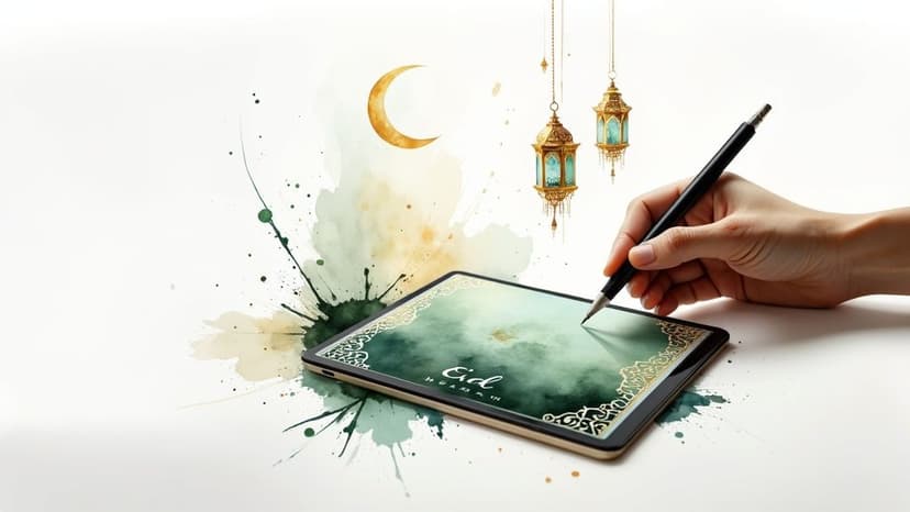
Create an Eid Mubarak Banner with AI
Learn how to design a stunning Eid Mubarak banner with AI. Our guide covers prompts, cultural tips, and how-to steps for a beautiful celebration.
November 23, 2025•12 min read
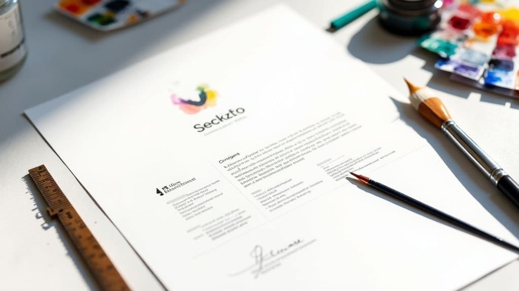
Discover tips to design an effective business letterhead template that boosts your brand and credibility. Start crafting yours today!
Instastock Team
October 9, 2025 • 9 min read
Let's be honest, a professional business letterhead template is so much more than just your logo and address slapped at the top of a page. It’s a quiet workhorse for your brand, making sure every single piece of communication—from a game-changing proposal to a routine invoice—looks sharp, consistent, and credible.
In a world of endless emails and instant messages, something tangible and well-designed really stands out. A proper business letterhead cuts through that digital clutter. Think about it: when you receive an official, printed document, it just feels more important, doesn't it? That's the weight a good letterhead lends to your communications. It’s a physical piece of your brand that signals you’re legitimate and you care about the details.
Imagine you’re sending over a vital proposal to a new client. An email can easily get buried, but a PDF delivered on your official letterhead demands to be taken seriously. The same goes for legal notices, formal job offers, or even a welcome letter to a new team member. Each of these moments carries more authority when presented on beautifully branded stationery.
This is particularly true in markets where traditional business practices still hold a lot of sway. In the UK, for instance, a quality letterhead isn’t just a nice-to-have; it’s an expected part of professional correspondence that directly shapes how people see your company. For legal documents and official announcements, that formal appearance is non-negotiable. If you're curious, you can find more insights on the specific importance of UK business letterheads from ClickDo.
Beyond just looking official, your letterhead is a powerful tool for reinforcing your brand identity. It keeps every touchpoint consistent, from the exact shade of your brand colours to the typography you use. This kind of consistency is what builds recognition and trust over time, making your brand more memorable to clients, partners, and anyone else you do business with.
A great letterhead doesn’t just carry a message; it is part of the message. It silently communicates your brand’s stability, attention to detail, and commitment to quality before a single word is even read.
At the end of the day, spending a bit of time on a solid letterhead design isn't just about making things look pretty. It's a smart business move to ensure every document you send out is working hard to build and protect your hard-earned reputation.
Before you even think about jumping into the design, let's talk prep work. Getting your core brand assets in order first is a non-negotiable step. Think of it as your mise en place for design; having everything ready to go makes the creative process a whole lot smoother and guarantees a professional, consistent finish. After all, a truly standout letterhead is always built on a solid brand foundation.
The first thing you need to grab is your high-resolution logo. Seriously, nothing screams unprofessional like a pixelated or blurry logo. Make sure you have a vector file (like an AI, EPS, or SVG) or, at the very least, a high-quality PNG. This ensures your logo looks sharp and clean, whether it's being printed on paper or viewed on a screen.
Next up, let's nail down your brand's visual language. This goes way beyond just picking colours you happen to like; it's about strategically using the elements that represent your company's personality and sticking to them.
Brand Colours: You'll want the specific HEX or RGB codes for your primary and secondary colours. This level of precision is what builds subconscious brand recognition. For example, using the exact #1DA1F2 is always going to be more effective than just winging it with a generic "Twitter blue."
Typography: Choose one or two main brand fonts. A common and effective approach is to have a primary font for headings and a secondary, super-readable font for the body text. Pairing a bold serif like Playfair Display with a clean sans-serif like Lato, for instance, creates a really nice, professional balance.
A well-defined brand toolkit is the difference between a random design and a strategic piece of communication. It ensures every document, including your letterhead, actively builds brand trust and recognition.
To make sure your letterhead perfectly aligns with your company's identity, understanding how to create brand guidelines is an absolute game-changer for maintaining a consistent visual presence.
And if you're building this from the ground up, don't worry. We've got a detailed guide on https://instastock.studio/blog/how-to-create-brand-guidelines that will walk you through the whole thing. A little prep now ensures your final business letterhead template is a true reflection of your brand.
Alright, let's get to the fun part—actually designing your letterhead. This is more than just plonking your logo on a blank document. It’s about creating a layout that feels professional, guides the eye, and still leaves plenty of room for your message. Think of it as the frame for your important communications; it should complement what you're writing, not overwhelm it.
The secret to a great layout is something called visual hierarchy. It sounds technical, but it’s really just about arranging things so the most important information, like your company name and logo, grabs attention first. Your contact details should be easy to find, and any legal bits like a company registration number can be tucked away neatly at the bottom. The aim is a natural flow, not a jumble of text.

When it comes to design, empty space—or whitespace—is your best friend. Don't be afraid of it! Using it generously around your logo and text is what makes a design feel clean, modern, and easy to read. A letterhead crammed with information just looks chaotic and unprofessional. By embracing whitespace, you let the content of your letter take centre stage.
Alignment is just as crucial. Whether you go for centred, left, or right alignment, keeping all your elements lined up creates an instant sense of order and polish.
A well-organised layout speaks volumes about your professionalism before a single word is even read. It subtly tells your recipient that you’re organised and pay attention to the details—qualities any business would want to project.
You don't need to start from a completely blank slate. There are a handful of classic layouts that have stood the test of time, each offering a slightly different vibe. Nailing these fundamentals is as important as having a clear vision in a design brief example for any other creative work.
Here are a few popular options I’ve seen work well:
Think about which style best fits your brand's personality. A creative agency might lean towards the modern sidebar, while a law firm would probably feel more at home with a traditional header. The most important thing is to make a conscious choice that reflects who you are.
Your letterhead design is sorted, but what you print it on says just as much about your brand. In a world where customers and clients are more eco-conscious than ever, the paper you choose can speak volumes. It's a small detail that can either reinforce your brand’s commitment to responsibility or completely miss the mark.
Think of it this way: a beautifully designed letterhead on flimsy, generic paper feels like a letdown. But that same design on a quality, sustainable stock? That’s a powerful statement.
This isn’t just a niche trend. The UK stationery market is seeing a real shift, with a growing demand for eco-friendly products driven by what people actually want to buy. Choosing sustainable paper aligns your brand with where things are heading.
Diving into paper choices might sound complicated, but it’s really quite straightforward. Most good suppliers now offer a fantastic range of sustainable stocks that don’t sacrifice that professional feel or quality finish.
Here are a few of the most common options you’ll come across:
Your choice of paper is a subtle but powerful part of your brand story. Opting for a recycled or FSC-certified stock quietly tells clients that you care about your impact on the world.
Making this small switch is a simple way to embrace sustainability and conscious living within your business. You could even add a tiny, discreet note in your footer – a small recycling symbol or the words "Printed on recycled paper" – to really connect with clients who share those values.
Alright, your design looks brilliant. Now for the final, and arguably most important, step: getting your new letterhead template into the hands of your team so they can actually use it. This is where a good design becomes a genuinely useful business asset, making sure every letter that leaves your company looks consistent and professional.
It all boils down to knowing which file format to use for which job. Trust me, a one-size-fits-all approach just doesn't work here. The file you send to a commercial printer is completely different from the one your colleagues will need for their day-to-day work in Microsoft Word or Google Docs.
When you're getting things professionally printed, you need a high-resolution format that locks everything in place. This is crucial for stopping any accidental shifts in your colours, fonts, or logo placement.
I've seen this happen countless times: people send an editable Word file to the printer or a locked-down PDF to their colleagues for daily use. Always, always create two separate versions: a print-ready PDF and an editable DOCX template.
When you export that PDF for printing, make sure the resolution is set nice and high—300 DPI (dots per inch) is the industry standard for a sharp, clean finish. If you find the file size is a bit chunky for emailing, don't worry. There are simple tricks for learning how to reduce the file size of photos and other graphics without sacrificing quality. This keeps your fantastic new letterhead both beautiful and easy to manage.
Once you've nailed the design of your business letterhead, a few practical questions almost always crop up. It's one thing to have a template that looks fantastic, but using it correctly day-to-day is a whole other ball game.
Let’s tackle some of the most common queries I hear from businesses trying to get their stationery just right.
This is probably the most critical question, especially for those of us in the UK. If you're running a limited company, there are some non-negotiable details you're legally required to include on all business letters, whether they're printed or sent digitally. This isn't just good practice; it's a legal requirement under the Companies Act 2006.
So, what information is mandatory to stay on the right side of the law?
While not always a legal must-have on a letterhead (it is for invoices), adding your VAT number is a smart move for consistency and professionalism.
It's so easy to forget that these rules apply just as much to your digital communications. Every official email or PDF letter sent from your business needs to have this information clearly visible. Don't get caught out!
I get asked this all the time. In theory, you could, but in practice, you really shouldn't. While your branding should look the same across both, the technical files need to be different to work properly.
For anything you're sending to a professional printer, you'll want a high-resolution PDF, ideally set to at least 300 DPI (dots per inch). This ensures everything from your logo to the fine print looks sharp and clear, not fuzzy.
For everyday digital use in programmes like Microsoft Word or Google Docs, you need a different beast. A DOCX file with the letterhead elements locked into the header and footer is the way to go. This simple step prevents your team from accidentally deleting the logo or shifting the contact details every time they write a letter.
Trust me, creating both a print-ready PDF and a user-friendly DOCX template from the get-go will save you a world of pain later.
Ready to create a business letterhead that truly stands out? With Instastock, you can generate custom logos and unique brand imagery in seconds. Stop searching for generic graphics and start creating visuals you completely own. Get started for free at Instastock.
Learn how to design a stunning Eid Mubarak banner with AI. Our guide covers prompts, cultural tips, and how-to steps for a beautiful celebration.

A friendly guide to creating beautiful Christmas trees vector graphics. Learn AI prompts, customization tips, and how to use your festive designs.
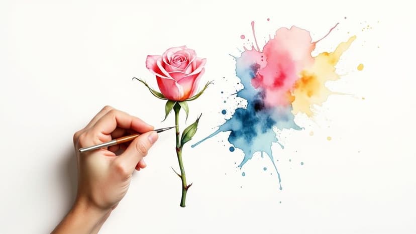
Learn how to create a stunning AI drawing of a flower. Our friendly guide covers everything from prompts and styles to editing your digital floral art.