
Create AI Christmas Scene Images
A friendly guide to creating beautiful AI Christmas scene images. Learn the prompts, tools, and tricks to bring your festive ideas to life in stunning detail.
October 13, 2025•13 min read
Want to design your own Christmas card? Our guide shows you how to use AI tools to create beautiful, custom holiday cards your family and friends will treasure.
Instastock Team
October 14, 2025 • 12 min read
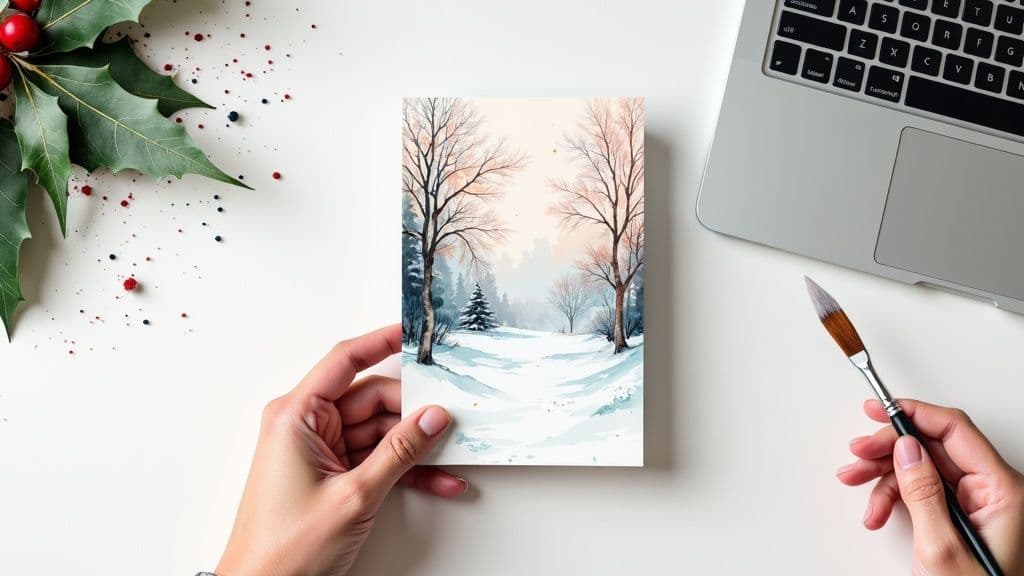
There's something truly special about creating a Christmas card that feels like you. It’s a chance to step away from the generic, shop-bought options and send a little piece of your family's story to friends and loved ones. With brilliant and accessible AI tools like Instastock, you don't need to be a professional designer to bring your vision to life.
This guide will walk you through the fun part: turning that flicker of an idea into a beautiful, finished card.

The journey to a one-of-a-kind Christmas card doesn't start with complicated software—it begins with a simple idea. Forget the pressure to be a world-class artist. The goal here is to create something that captures your personality, whether that's through a laugh-out-loud illustration, a classic winter wonderland, or a stylised family portrait.
The beauty of designing your own card is that it’s rooted in your story. Think about what made this year special. Did you go on a memorable family holiday? Welcome a new pet into the fold? These are the golden nuggets that make a card feel genuine and heartfelt.
Before you even think about opening a design tool, take a moment to dream a little. What feeling do you want your card to give off? Warm and cosy? Bright and cheerful? Or maybe something more modern and minimalist?
Don't hold back. Just jot down any and every idea that pops into your head. If you need a little nudge, here are a few starting points to get the creative juices flowing:
The cards people remember are the ones that feel personal. Don't aim for perfection. Instead, focus on creating something that genuinely reflects your family's spirit and will bring a smile to your loved ones' faces.
Here in the UK, sending Christmas cards is a tradition we all hold dear. The greeting card market was valued at a massive £1.4 billion back in 2020, which just goes to show how much we value this simple act of connection. But the tradition is changing, with more and more of us wanting cards that truly stand out from the crowd.
If you want to start thinking more like a designer, it helps to get your head around the basic creative steps. For anyone new to this, we recommend understanding the graphic design process—it offers a solid foundation that you can apply to any project, including your festive creation.
Right, this is where the real fun begins and your vision starts to come to life. The secret to coaxing a truly stunning, one-of-a-kind image from an AI generator like Instastock isn’t about being a tech wizard; it's all about writing a great prompt.
Think of it like this: you’re directing a ridiculously talented artist who's ready to paint exactly what's in your head. Just barking "Christmas!" at them won't get you very far. You'll get something, sure, but it'll probably be generic. The magic happens when you add layers of detail, turning a vague idea into a specific piece of art that’s perfect for your card.
A brilliant prompt is really just a mix of a few key ingredients. You won't need every single one for every image, but learning to combine them is how you'll nail the look you're after. Your job is to paint a picture with your words.
I always recommend starting with your main subject and then layering on details about the style, the mood, and even the lighting. Every little bit of information you add helps guide the AI closer to what you’re imagining.
Here’s a simple formula I’ve found works wonders:
Let’s see how that works. Say you want an image of a reindeer. Instead of just typing "reindeer," you could build it up like this: "A charming watercolour illustration of a joyful reindeer wearing a scarf, in a snowy forest at twilight, with glowing fairy lights on its antlers, whimsical and cosy." See the difference? That level of detail is what separates a good card from a great one.
My two pence: Don't be shy about experimenting! Honestly, some of the best images come from weird and wonderful combinations you wouldn't expect. Try swapping "watercolour" for "vintage cartoon style," or change the mood from "cosy" to "magical and mysterious." You might be surprised by what you create.
Let's have a look at how Instastock’s AI Image Generator handles these kinds of instructions.

The interface is lovely and simple. It lets you focus on being creative with your description instead of getting tangled up in confusing settings. This is your canvas, and your words are the paint.
To give you a clearer idea, here’s how a few vague prompts can be transformed into something far more effective.
| Vague Prompt | Detailed & Effective Prompt |
|---|---|
| "Christmas fireplace" | "A cosy, vintage-style illustration of a brick fireplace decorated with stockings and lush holly, warm and inviting light." |
| "Snowy village" | "A peaceful, photorealistic image of a snow-covered village in the Cotswolds at dusk, with smoke curling from chimneys." |
| "Christmas tree" | "A close-up shot of a minimalist Scandinavian Christmas tree with delicate white and gold baubles, soft focus background." |
Notice how the better prompts specify not just the what but also the how. Using powerful words like "photorealistic," "minimalist," and "vintage-style" gives the AI clear artistic direction.
If you’re ever stuck for ideas, a great place to start is by browsing a gallery of AI-generated Christmas scene images. It can give you some fantastic inspiration for styles and subjects to try out. Getting the image just right is an enjoyable little process of trial and error, and it puts you completely in control.
Alright, you've coaxed a brilliant festive image out of Instastock’s AI. That’s the fun part done. Now, let’s give your masterpiece the frame it deserves. When you design your own Christmas card, the layout is every bit as crucial as the artwork—it sets the mood and makes sure your image really sings.
First things first: what kind of card are you making? A classic folded card has that wonderful sense of occasion. It gives you plenty of room inside for a heartfelt, handwritten message and works beautifully for those detailed, artsy images you want people to savour.
On the flip side, a modern postcard is punchy and informal. It’s perfect for bold, graphic designs or a funny, cartoonish scene that captures a more playful vibe. Think about who’s getting it and what feel you’re going for.

Once you’ve settled on the format, it's all about balance. A common trap is cramming something into every corner. Don’t be afraid of empty space! White space (or negative space, as designers call it) lets your design breathe and instantly makes it look more polished and professional.
Here are a few simple but effective layout ideas to get you started:
My two cents: The whole point is to guide the eye. Your amazing artwork is the star of the show; the text is just the supporting act. A well-balanced design just feels right—it’s calm, intentional, and easy on the eyes.
Before you go all-in, it’s a brilliant idea to see how your design will look in the real world. A quick way to do this is with a quality greeting card mock-up. It helps you spot any awkward spacing or alignment issues before you send anything to print.
Now for the final flourish: fonts and background colours. These are the elements that pull your whole design together. The trick is to pick a font that echoes the style of your artwork. Got a quirky, hand-drawn illustration? A beautiful script font will complement it perfectly. If your design is clean and modern, a simple sans-serif typeface is your best bet.
Finding the perfect font pairing can feel a bit tricky, but it makes a huge difference. Here’s a quick cheat sheet to get you started.
| Style Combination | Best For | Example Pair |
|---|---|---|
| Script + Sans-Serif | An elegant and modern feel. The script adds flair, while the sans-serif keeps it readable. | Great Vibes with Montserrat |
| Serif + Sans-Serif | A classic, timeless look. Perfect for traditional Christmas messages. | Playfair Display with Lato |
| Playful Script + Simple Sans | A fun and informal vibe, great for cards with a bit of humour or whimsy. | Pacifico with Raleway |
| Bold Display + Light Body | A high-impact greeting. Use the bold font for "Merry Christmas" and the light one for details. | Oswald with Roboto |
These are just suggestions, of course—the best way to find what works is to experiment!
When it comes to the background, choose a colour that either complements or contrasts with the main hues in your image. You want it to pop, not get lost. A neat feature in Instastock is the colour sampler—you can pull a shade directly from your AI-generated image. This guarantees a perfectly coordinated, professional finish for your card. Easy.
You’ve got your stunning AI artwork and a beautifully balanced layout. Brilliant! Your card is so close to being finished. Now for the bit that really turns it from a pretty picture into a cherished keepsake: your personal message. This is where you get to connect, share a little piece of your year, and send a genuine wish of warmth and joy.
What you write doesn't have to be a long, elaborate letter. Honestly, the simplest messages are often the most powerful. Just think about who you're sending it to. A short, sweet "Wishing you a very Merry Christmas and a Happy New Year!" is perfect for colleagues or neighbours. For your closest friends and family, something a bit more personal, like mentioning a funny memory from the summer, will mean the world.

This focus on the personal touch is a massive part of why people design their own cards in the first place. In the UK, the market for celebration occasions is worth a staggering £13.4 billion, and a huge part of that is our desire for unique, heartfelt connections over generic greetings. You can read more about how personalisation is shaping the UK card market to see just how much we all value that special something.
Once you’ve settled on the perfect words, it’s time to add them to your design in Instastock. The absolute key here is readability. You want your message to complement your artwork, not fight with it for attention.
Start by choosing a font that fits the mood you’ve already created. We touched on font pairings earlier, so let that be your guide. Try to place your text in an area with a simple background, steering clear of any busy patterns or really dark parts of your image. If your design doesn’t have a natural empty space, no worries – you can easily add a semi-transparent shape (like a rectangle or circle) behind your text to make it pop.
Here are a few technical tips I've picked up:
This is it – the last creative step before your design is ready for the world! It’s your chance to add those subtle, final touches that give your card a truly polished, one-of-a-kind feel. Think of it like adding the perfect garnish to a delicious meal.
You really don’t need much to make a big impact. A simple, thin border around the edge of the card can frame your design beautifully. Or, you could sprinkle in a few subtle, low-opacity elements like snowflakes or stars in the background to add a touch of festive magic without overwhelming the main image.
The goal is to enhance, not distract. The best final touches are the ones you almost don't notice at first, but they work together to create a complete and thoughtful design. Less is very often more.
Once you’re happy with every little detail, take a moment to step back. Look at your creation as a whole. Does it feel balanced? Does it capture the festive spirit you were hoping for? This final check makes sure your card is ready for printing and, most importantly, ready to bring a smile to someone's face.
You’ve poured your creativity into designing a gorgeous, one-of-a-kind Christmas card. Now for the final, crucial step: making sure it looks just as brilliant on paper as it does on your screen. Don't worry, this part is much simpler than it sounds.
Think of it as giving the printer a perfect blueprint. We just need to check a few technical details to ensure your digital masterpiece translates flawlessly into a physical keepsake.
When you're designing anything for print, you'll hear two terms pop up again and again: DPI and file format. Let's break them down.
DPI means "Dots Per Inch," and it's all about print sharpness. For a crisp, professional-looking card with no fuzzy edges, you absolutely must export your design at 300 DPI. This is the gold standard for high-quality printing, so don't settle for less.
Next up is the file format. You’ll usually be given a choice between JPEG and PNG.
If your finished file is a bit too hefty for the printer's website, don't panic! Our guide on how to reduce the file size of your photos has some easy tricks to shrink it down without losing any quality.
The paper you print on can completely change the vibe of your card. It's not just about the design itself, but the whole experience of holding it in your hands.
Glossy card stock will give your colours a vibrant, shiny pop, making it a fantastic choice for photo-heavy cards. On the flip side, matte card stock has a more understated, elegant feel with zero glare, which I find works beautifully for classic illustrations or text-focused designs.
A Quick Tip: Feeling stuck? Most good printers will happily send you a sample pack. There’s no substitute for actually feeling the different paper types to see which one truly fits your design and style.
It's also worth noting that here in the UK, there's been a lovely move towards greener options. As we've all become more eco-conscious, materials like recycled paper and even plantable seed cards are becoming really popular. You can actually discover insights into the UK card market and see how this trend towards sustainability and personalisation is shaping what we send.
And my final piece of advice: always, always ask your printer for a digital proof before they hit 'print' on the full batch. This is your last chance to catch any sneaky typos, wonky alignment, or colours that look a bit off. A quick final check guarantees your cards will be absolutely perfect.
Stepping into the world of AI to design your Christmas cards is a blast, but it's totally normal to have a few questions swirling around before you jump in. Let's clear up some of the common queries I hear all the time.
Think of this as a quick chat to smooth out any bumps in the road, making your journey from a spark of an idea to a finished card as fun as it should be.
This is the big one, and thankfully, the answer is straightforward. For a sharp, professional-looking print that does your design justice, you need to aim for 300 DPI (dots per inch).
When you download your final masterpiece from Instastock, always grab the highest quality or 'print quality' version. This one simple step is the key to making sure your incredible AI artwork and personal message don't end up looking fuzzy or pixelated. It’s what separates a "homemade" look from a "wow, where did you get these?" result.
Absolutely, you just have to be a little clever about it. Because of copyright, you can't just plug in an artist's name and hit 'go'. But what you can do is describe their signature style in your prompt. It’s a great way to nudge the AI in the aesthetic direction you’re aiming for.
For instance, instead of saying "a painting by Van Gogh," you could try something like this:
This gives the AI all the clues it needs to capture that specific energy and texture, all while making sure your final image is 100% unique. For anyone looking to go deeper, exploring different AI content generation tools can really open up a world of creative possibilities.
First off, don't panic! This happens all the time and is a completely normal part of the creative dance with AI. Your first few attempts are rarely going to be the final version. The secret is to simply tweak and refine your prompt.
Think of it as a conversation. If the AI didn't quite get it, give it more specific directions. Add more detail, swap out a few words, or try describing your vision from a completely different angle.
My best advice is to treat it like a fun experiment. A prompt for "a snowman in a field" might be a bit bland. So, kick it up a notch: "a cheerful, cartoon snowman wearing a top hat and a red scarf, standing in a snowy field at sunset, with soft warm lighting." Iteration is your secret weapon.
Honestly, a few small adjustments are often all it takes to go from a generic image to the perfect centrepiece for your Christmas card.
Ready to bring your unique Christmas card ideas to life? With Instastock, you can generate stunning, one-of-a-kind images in seconds and design a card that’s truly personal. Start creating for free today and see what you can imagine.
A friendly guide to creating beautiful AI Christmas scene images. Learn the prompts, tools, and tricks to bring your festive ideas to life in stunning detail.

Discover 8 inspiring types of new home images, from minimalist exteriors to smart tech. Find the perfect visual inspiration for your next project or purchase.

Discover 8 top construction companies logos that build strong brands. Get strategic design insights and actionable tips to inspire your next logo project.