
Create Stunning Clipart Black and White Designs
A friendly guide to creating professional clipart black and white. Learn AI prompting, vectorization, and how to refine your designs for amazing results.
November 26, 2025•16 min read
Discover 8 top construction companies logos that build strong brands. Get strategic design insights and actionable tips to inspire your next logo project.
Instastock Team
October 11, 2025 • 14 min read
In the world of steel, concrete, and heavy machinery, a logo is more than just a picture; it's a hard hat, a seal of quality, and a company's handshake all rolled into one. Great construction companies logos do more than just look good on the side of a lorry, they communicate reliability, strength, and expertise at a single glance. They build trust before the first foundation is even poured.
This article will deconstruct 8 standout logos from the construction industry, revealing the strategic blueprints behind their designs. We'll explore the psychology of their colours, the strength in their typography, and the clever symbolism that makes them memorable. While your logo is a cornerstone, a holistic approach to building a strong identity often involves broader considerations; discover valuable small business branding tips to enhance your overall brand presence.
Whether you're a designer looking for inspiration or a construction firm aiming to refresh your brand identity, you'll find actionable takeaways to help you build a logo that's as solid and enduring as the structures you create. Let's dig in and see what makes these iconic brands tick.
When you think of construction, it’s hard not to picture the iconic “Caterpillar Yellow” machinery dominating a worksite. The Caterpillar (or CAT) logo is a masterclass in creating an industrial brand identity that’s both powerful and instantly recognisable. It perfectly demonstrates how a simple wordmark, combined with a strategic colour choice, can become a global symbol of strength and reliability.
The logo’s core is its bold, custom sans-serif typeface. The letters are thick and grounded, conveying a sense of stability and raw power. The most clever element, however, is the red triangle embedded within the letter ‘A’. This small but mighty shape subtly evokes movement, precision, and the strength of a pyramid, all key attributes in the construction industry. This design proves that among construction companies logos, simplicity often packs the biggest punch.
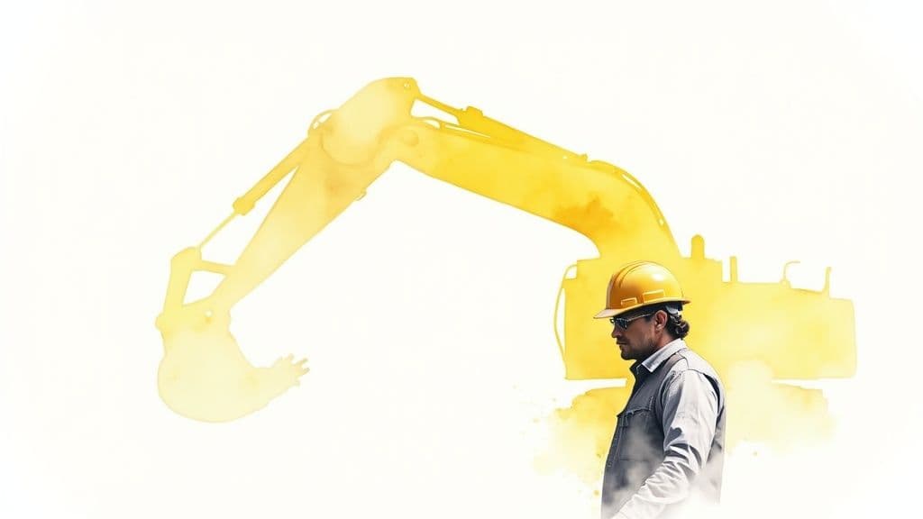
The genius of the CAT logo lies in its rugged adaptability. The primary colours, black and yellow, were chosen for maximum visibility on busy, dirty construction sites, directly linking the brand to safety and presence. This colour palette isn’t just an aesthetic choice; it’s a functional one.
The brand has also successfully created two distinct but related identities: the full “Caterpillar” wordmark for corporate branding and the shorter, punchier “CAT” logo, which is more commonly seen on machinery and merchandise. This dual approach allows for flexibility across different applications, from enormous earth-movers to licensed apparel.
Key Insight: Caterpillar’s logo strategy is built on environmental context. The design prioritises high visibility and ruggedness, ensuring the brand stands out in the exact environments where its products are used.
While some construction brands lean into rugged, industrial aesthetics, Bechtel opts for a different path, projecting an image of corporate precision, heritage, and engineering excellence. Its logo is a testament to the power of classic typography, demonstrating that a wordmark can convey immense authority and trust without relying on symbols or graphical elements. It’s a design choice that speaks directly to its B2B audience of governments and large corporations.
The Bechtel logo uses a clean, custom serif typeface that feels both modern and deeply rooted in history. The serifs add a touch of classicism and sophistication, suggesting a legacy of quality and meticulous planning. Paired with a bold red, the logo strikes a perfect balance between energetic innovation and dependable tradition. This refined approach distinguishes it among construction companies logos by emphasising intellectual prowess over raw physical strength.
Bechtel's strategy is to position itself not just as a builder, but as a premier engineering and project management partner. The logo's clean, academic feel is perfect for corporate communications, technical documents, and project proposals where credibility is paramount. The single-colour red is confident and professional, ensuring the brand is recognisable whether on a massive project site banner or a detailed engineering schematic.
Unlike brands that need to be visible on muddy machinery, Bechtel’s logo is designed for clarity in a corporate context. It’s legible at small sizes on technical documents and maintains its professional integrity on large-scale signage. This focus on typographical perfection reinforces the company’s core values: precision, quality, and expertise. This approach is highly effective in their design of catalogues and other corporate materials.
Key Insight: Bechtel's logo strategy is built on intellectual authority. It uses classic, clean typography to communicate engineering expertise and corporate reliability, appealing to clients who value precision and professionalism above all.
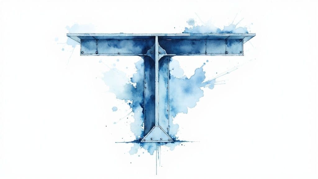
Turner Construction’s logo is a prime example of how to blend corporate reliability with architectural sophistication. The design moves beyond the rugged, machinery-focused aesthetic to represent the precision and scale of major building projects, from sports stadiums to healthcare facilities. It communicates trust and expertise, crucial for a company responsible for iconic and complex structures.
The logo’s strength lies in its bold, blue wordmark combined with a distinctive geometric symbol. This stylised element resembles a building's framework or a blueprint schematic, directly referencing the architectural and engineering prowess behind their work. The deep blue colour palette reinforces feelings of stability, professionalism, and integrity, making it a standout among construction companies logos that aim for a more corporate, high-end market.

Turner’s logo strategy is rooted in conveying corporate credibility. Unlike brands focused on raw materials or heavy machinery, Turner’s identity is built to inspire confidence in clients undertaking massive, multi-million-pound projects. The clean lines and professional typeface appeal to architects, project managers, and corporate stakeholders.
The geometric mark is abstract enough to be modern but literal enough to be understood as a symbol of construction and planning. It acts as a visual shorthand for quality and meticulous execution. This balance allows the brand to appear both innovative and deeply established, a difficult yet essential combination in the high-stakes world of commercial construction.
Key Insight: Turner’s logo successfully targets a different audience. It’s designed not for the on-site worker but for the boardroom, prioritising professionalism, trust, and architectural precision over ruggedness.
In an industry often associated with raw materials and heavy machinery, the Skanska logo stands out with a fresh, forward-thinking aesthetic. It champions a different narrative within construction, focusing on sustainability, innovation, and environmental responsibility. The logo perfectly marries Scandinavian design simplicity with a powerful corporate message, making it a benchmark for modern construction companies logos.
The design features the company name in a clean, sans-serif font, paired with a stylised 'S' emblem. This emblem, composed of green and blue flowing lines, evokes a sense of movement, progress, and nature. The blue suggests professionalism and water, while the vibrant green directly communicates a commitment to sustainable building and green projects, setting it apart from more traditional, earth-toned branding.
Skanska’s logo strategy is built on differentiation through values. While competitors often lean on symbols of strength and power, Skanska’s branding consciously highlights its commitment to "green" construction and corporate social responsibility. The colour palette is not accidental; it is a direct reflection of their market position as a leader in sustainable development and LEED-certified projects.
The flowing, wave-like emblem is versatile, symbolising everything from environmental cycles to the flow of progress and data in smart city development. This abstract mark allows the brand to speak to a broader audience, including urban planners, environmental stakeholders, and corporate clients who prioritise sustainability. The logo effectively communicates that Skanska builds for the future, not just the present. When creating presentations on this topic, it's wise to explore how you can use high-quality images to convey these abstract ideas visually.
Key Insight: Skanska’s logo uses colour and form to align its brand identity with the growing global demand for sustainable and environmentally conscious construction, successfully carving out a unique and modern niche.
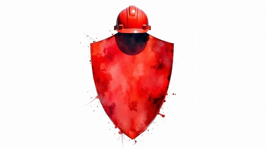
Kiewit Corporation’s logo is a powerful emblem of trust and industrial might, perfectly suited for one of North America's largest and most respected construction and engineering organisations. The design is built around a bold, shield-like container that houses the company’s name, immediately conveying concepts of protection, durability, and unwavering reliability. This isn't just a logo; it's a badge of honour.
The core of the logo is its commanding, uppercase wordmark set in a strong, sans-serif typeface. The letters are spaced to fill the shield, creating a unified and solid block of text. The choice of a deep red colour evokes a sense of urgency, power, and importance, fitting for a company that undertakes critical infrastructure projects. Among the many construction companies logos that use symbols, Kiewit’s shield is a direct promise of strength and dependability.
The brilliance of the Kiewit logo is its use of a classic symbol - the shield - to build immediate trust. In an industry where safety, stability, and reliability are paramount, the shield is a universal signifier of these values. It tells clients and partners that Kiewit is a protector of their interests and a guardian of project integrity from start to finish.
This badge-style design is also incredibly versatile. It works just as well on the side of a hard hat as it does on official corporate documents or massive tunnel-boring machines. The self-contained shape ensures it remains coherent and impactful at any size, a crucial feature for a brand with a presence across vast and varied worksites. The design's simplicity guarantees it won't become dated, reflecting the company's long-standing history since 1884.
Key Insight: Kiewit’s logo leverages universal symbolism to communicate its core brand promise. The shield shape instantly conveys protection and reliability, which are non-negotiable qualities in large-scale infrastructure construction.
Fluor Corporation’s logo stands out in the engineering and construction sector with its clean, professional, and refreshingly bright aesthetic. It masterfully balances corporate seriousness with an energetic and modern feel, moving away from the heavy, earth-toned palettes often seen among construction companies logos. The design is a simple yet effective wordmark that communicates precision, innovation, and global reach.
At its heart is a straightforward, sans-serif typeface that feels approachable and efficient. The most defining feature is its vibrant orange colour, which immediately injects a sense of energy, creativity, and optimism into the brand identity. This choice allows Fluor to project confidence and forward-thinking, positioning itself as a leader in complex global projects, from oil and gas facilities to major infrastructure developments.
The brilliance of Fluor’s logo is its strategic use of colour to differentiate in a crowded market. While many competitors lean on traditional blues, reds, or blacks to convey reliability, Fluor’s orange is both memorable and distinctive. It helps the brand stand out while also associating it with safety and high visibility, a critical element in the construction and engineering fields.
The logo’s simplicity is its strength, especially for a multinational corporation. A clean wordmark translates easily across different cultures, languages, and applications, from corporate letterheads to massive banners on international project sites. This ensures a consistent and professional brand image, reinforcing Fluor's reputation for engineering excellence and meticulous project management on a global scale.
Key Insight: Fluor’s logo strategy uses colour as a primary differentiator. By choosing a vibrant, modern hue, the brand effectively signals innovation and energy in an industry often defined by tradition and brute strength.
Unlike logos built on raw power, the AECOM brand mark represents a more sophisticated and strategic side of the construction industry. As a global infrastructure consulting firm, its logo needs to convey technical precision, global connectivity, and professional trust. It accomplishes this with a clean, modern design that feels both corporate and forward-thinking, making it a standout among construction companies logos for its intellectual approach.
The logo’s wordmark is crafted from a custom sans-serif typeface, where the letters are interconnected to symbolise the integration of its diverse services, from planning and design to engineering and construction management. The choice of a calming, professional blue reinforces a sense of reliability and expertise. The design elegantly communicates that AECOM isn’t just about building structures; it’s about connecting communities and creating comprehensive, holistic solutions.
The strength of the AECOM logo is its ability to represent a complex, multinational firm with a single, unified idea: integration. The connected letters in the wordmark are not just a stylistic choice; they are a visual metaphor for the company’s name, which is an acronym for Architecture, Engineering, Consulting, Operations, and Maintenance. This typographic link visually expresses how these disciplines work together under one roof.
This approach positions AECOM as a partner in large-scale, complex projects rather than just a contractor. The professional blue and clean typography appeal to a different audience, including government bodies, city planners, and corporate clients. It’s a design built for the boardroom, not just the building site, demonstrating a deep understanding of its target market. To maintain such a clean identity across a global brand, it’s essential to have strong guidelines. Learn more about how to create brand guidelines on instastock.studio to ensure consistency.
Key Insight: AECOM’s logo is a masterclass in conceptual branding. It uses custom typography to visually represent its core business model of integrated services, creating a meaningful and memorable identity.
Mortenson’s logo is a stellar example of how a modern, geometric lettermark can communicate precision, innovation, and reliability. Moving away from the rugged, earth-toned aesthetics common in the industry, Mortenson opts for a clean and corporate feel that speaks to their work on complex, high-tech projects like data centres and sports stadiums. It’s a design that feels less like a traditional builder and more like a forward-thinking construction partner.
The logo’s strength comes from its distinctive 'M' symbol, constructed from bold, interlocking shapes. This geometric mark isn't just a letter; it represents partnership, structural integrity, and the interconnected components of a major project coming together. The strong, sans-serif wordmark alongside it grounds the design in professionalism, creating a balanced identity that is both memorable and sophisticated, making it a standout among construction companies logos.
The brilliance of the Mortenson logo is its ability to convey multifaceted values through a simple, abstract mark. The clean lines and sharp angles project accuracy and technical expertise, appealing to clients in sectors like healthcare and renewable energy where precision is non-negotiable. The chosen blue is a deep, trustworthy colour that evokes stability and intelligence, positioning the company as a leader in innovative building solutions.
This design is also incredibly versatile. The stylised 'M' works powerfully on its own as a standalone icon for digital applications, hard hats, or apparel, while the full lock-up maintains a formal, corporate presence. This flexibility allows Mortenson to maintain a consistent brand identity across a diverse portfolio, from massive wind farms to intricate university facilities, without the logo ever feeling out of place.
Key Insight: Mortenson’s logo strategy uses geometric abstraction to symbolise core values. The design moves beyond literal construction imagery to communicate sophisticated concepts like precision, partnership, and innovation.
| Logo | Implementation Complexity 🔄 | Resource Requirements ⚡ | Expected Outcomes 📊 | Ideal Use Cases 💡 | Key Advantages ⭐ |
|---|---|---|---|---|---|
| Caterpillar Inc. Logo | Low – simple shapes and limited color palette | Moderate – consistent yellow/black reproduction | High – strong brand recognition and visibility | Heavy machinery branding, construction site visibility | Instantly recognizable, conveys industrial strength |
| Bechtel Corporation Logo | Low – typography-focused, minimal design | Low – easy reproduction across media | Moderate – professionalism and credibility | Corporate communications, government projects | Projects engineering expertise, timeless design |
| Turner Construction Logo | Medium – geometric architectural elements | Moderate – balanced symbol and text | High – professional and precise image | Commercial projects, stadiums, healthcare | Conveys trust and structural precision |
| Skanska Logo | Medium – flowing design elements with integrated wordmark | Moderate to high – color consistency and detail | High – emphasizes sustainability and innovation | Green building, sustainable urban development | Strong environmental commitment, distinctive color palette |
| Kiewit Corporation Logo | Medium – shield design with bold typography | Moderate – careful reproduction of complex shapes | High – authoritative and reliable presence | Heavy construction, infrastructure projects | Memorable shield symbol, conveys protection and strength |
| Fluor Corporation Logo | Low – minimal, modern wordmark | Low – simple color and typography | Moderate – professional and global visibility | Engineering projects, oil and gas, industrial construction | High visibility color, versatile design |
| AECOM Logo | Medium – custom typography with integrated design element | Moderate – requires typography precision | High – trusted, modern corporate identity | Infrastructure consulting, transportation, environmental engineering | Distinctive typography, conveys connectivity and expertise |
| Mortenson Construction Logo | Medium – bold lettermark with geometric styling | Moderate – balanced symbol and wordmark | High – confident, versatile brand image | Sports stadiums, healthcare, renewable energy | Strong lettermark, memorable and professional |
We've explored the foundations of some of the most recognisable construction companies logos, from the industrial might of Caterpillar to the modern, sustainable vision of Skanska. As we've seen, these are not just simple graphics; they are strategic assets meticulously designed to communicate trust, expertise, and a unique market position. They are the hard hats and steel-toed boots of a brand's visual identity, built for purpose and designed to last.
The journey through these examples has revealed a clear blueprint for success. The most impactful logos are born from a deep understanding of the company's core values and its target audience. They are far more than just a name on a sign; they are a promise of quality, safety, and reliability delivered in a single, memorable mark.
Reflecting on the giants like Bechtel, Turner, and Kiewit, several core principles stand out as essential for any construction brand looking to build a powerful visual identity:
Armed with these insights, you are now equipped to lay the groundwork for a logo that truly represents your construction business. Start by defining what makes your company unique. Are you known for cutting-edge technology, historical preservation, or unparalleled project management? This core truth should be the bedrock of your design process.
Remember, a great logo is the cornerstone of your entire brand presence. It sets the tone for your marketing materials, your vehicle livery, and your digital footprint. To see how a powerful logo integrates into a comprehensive online presence and contributes to a professional brand, explore these examples of good construction company websites. Integrating your new visual identity seamlessly across all platforms is what transforms a good logo into a great brand.
Ultimately, designing effective construction companies logos is about creating a mark that is as strong and dependable as the structures you build. It should inspire confidence in clients, foster pride among your team, and stand as a timeless symbol of your commitment to excellence.
Ready to bring your construction brand's vision to life with stunning visuals? Find the perfect, high-quality images and videos for your marketing projects with Instastock. Explore our curated library of industry-specific assets at Instastock and start building a brand that stands out.
A friendly guide to creating professional clipart black and white. Learn AI prompting, vectorization, and how to refine your designs for amazing results.

Learn how to make promotional videos that capture attention and drive results. Our guide covers scripting, production, and distribution for real impact.

Explore our guide to the 12 best AI tools for graphic design. Find top picks for image creation, workflow automation, and brand-safe visuals in 2025.