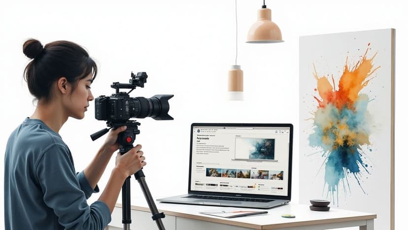
How to Make Promotional Videos People Actually Watch
Learn how to make promotional videos that capture attention and drive results. Our guide covers scripting, production, and distribution for real impact.
November 25, 2025•16 min read
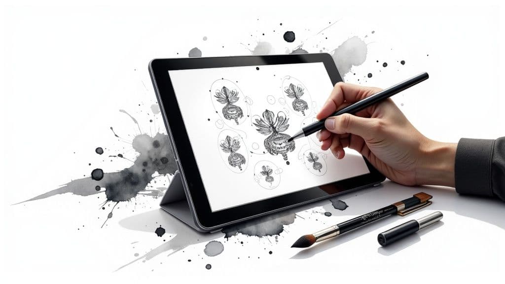
A friendly guide to creating professional clipart black and white. Learn AI prompting, vectorization, and how to refine your designs for amazing results.
Instastock Team
November 26, 2025 • 16 min read
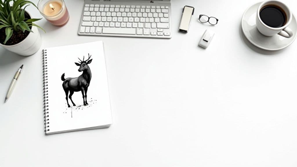
Black and white clipart is a bit of a secret weapon for designers and creators. It’s got this incredible blend of simplicity, clarity, and cost-effectiveness that makes it a go-to for just about anything, from classroom worksheets to slick, minimalist branding. The real magic is in how it gets a message across clearly, without the distraction of colour. This gives it a focus and versatility that’s hard to beat.
Before we jump into the ‘how-to’, it’s worth taking a moment to appreciate the ‘why’. We live in a world bursting with vibrant, full-colour images, so what is it about simple monochrome graphics that gives them such staying power? It really comes down to a mix of practical perks and solid design principles.
Functionally, black and white clipart is just incredibly efficient. It’s almost always cheaper and faster to print, which is a massive plus for schools, small businesses, or anyone churning out large quantities of documents. This isn’t some new fad; its roots go deep into the early days of digital design.
Here in the UK, you can trace the love for black and white clipart back to the desktop publishing boom of the 1980s and 90s. Back then, early laser printers and low-res screens made monochrome the standard out of pure necessity. This created a visual style that, even as technology caught up, stuck around because it was so budget-friendly for offices and classrooms.
That legacy of simplicity still has a huge impact on modern design. When you strip away colour, you’re forcing the eye to focus on the core elements of the image – the shape, the line, the form. This deliberate constraint often makes your message much clearer and more powerful. It’s an approach you see everywhere, from technical diagrams to high-end fashion branding. For a closer look at this, check out our guide on the power of https://instastock.studio/blog/black-and-white-logos.
By sidestepping the complexities of colour theory, black and white clipart lets you focus entirely on communication. What you get is a graphic that’s often more direct, universally understood, and emotionally resonant.
Beyond its history, choosing clipart black and white is a smart, strategic move for a few key reasons. This isn’t just about saving on ink; it's about setting a specific tone and making sure your visuals are bulletproof.
Ultimately, getting good at creating black and white clipart adds a seriously versatile tool to your creative toolkit. It’s a foundational skill that will serve you well across countless projects.
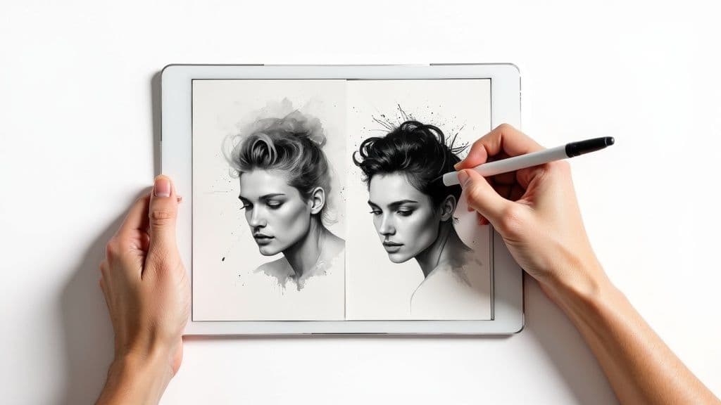
Right, this is where the fun begins. It's time to translate that creative idea in your head into a language the AI can understand. The trick to getting great results isn't about knowing some secret code; it’s about being clear and specific with your instructions. If you just throw vague ideas at it, you'll get vague, unusable images back.
Think of yourself as an art director. Instead of just asking for "a dog," you need to direct the AI. What style? What angle? What key features? A little bit of effort here saves a massive amount of cleanup time later. Trust me, it’s worth it.
The real secret to a brilliant AI image is in how you structure your prompt. A well-organised set of instructions steers the AI exactly where you want it to go, helping you sidestep those muddy, grey, and overly complicated outputs that are all too common.
Over time, I've found a simple formula that works wonders for clean line art. I always start with the main subject, then define the style, and finally layer on any extra details or technical specs. This approach builds a really clear picture for the AI. For example, "flower clipart" becomes "Minimalist line art of a single daisy, clean lines, high contrast, black and white."
That small change from a simple noun to a descriptive phrase makes all the difference. It tells the AI what to prioritise right from the get-go. If you want to dive deeper into the nuts and bolts, our full guide on how to generate images with AI is a great place to start.
A prompt is really just a recipe. The more precise your ingredients and instructions, the better the final dish. Vague prompts give you unpredictable, and often unusable, results.
Let's be honest, not all black and white clipart is created equal. You might be after a delicate, single-line drawing, or maybe something bold and chunky like a woodcut print. The keywords you pick will completely define the look and feel of your final piece.
Here are a few combinations I find myself coming back to again and again:
Don't be afraid to experiment and mix these up. Sometimes you can get fantastic, unexpected results, like a "cute cartoon woodcut of a bear." And for those who really want to push the boundaries, it’s worth understanding advanced AI image generation models like Nano Banana Pro to see what's possible.
To make this a bit clearer, I've put together a quick table showing how different prompt styles can shape your final image.
This table breaks down how different prompt components can really influence the final AI-generated image, giving you a handy cheat sheet for choosing the right style for your project.
| Prompt Style | Core Keywords | Best For | Example Prompt Snippet |
|---|---|---|---|
| Minimalist Line | icon, line art, simple, vector | Web icons, logos, clean user interfaces | simple icon of a coffee cup, minimalist line art |
| Woodcut Print | woodcut, engraving, block print, high contrast | Textured illustrations, vintage branding | woodcut print of an oak tree, bold black lines |
| Colouring Page | colouring page, bold outline, for kids, simple | Educational materials, activity sheets | colouring page of a friendly dinosaur, bold outline |
| Ink Sketch | pen and ink, sketch, hatching, cross-hatching | Artistic illustrations, editorial graphics | pen and ink sketch of a London street scene |
Having these in your back pocket will help you quickly dial in the exact aesthetic you're looking for without endless trial and error.
Telling the AI what you want is only half the battle. You also have to tell it what you don't want. This is where negative prompts become your best friend, especially for creating pure black and white clipart. They are absolutely essential for dodging the most common issues.
The biggest problem you'll run into is the AI sneaking in unwanted grey tones, soft shadows, or blurry edges. These things make it a nightmare to vectorise your image later on. By explicitly telling the AI to avoid them, you push it towards a much crisper, cleaner result.
Here are the negative prompts I use on almost every single black and white generation:
grey, grayscale, shades of grey: This is non-negotiable. It ensures you get true black and white, not just a desaturated photo.shadows, gradients, blur: Use these to kill any soft transitions and force the AI to produce sharp, clean edges.photorealistic, 3D, render: Unless you’re specifically going for that look, these keywords help keep the image flat and graphic, which is ideal for clipart.text, signature, watermark: AI models love to add gibberish text or fake artist signatures. This prompt helps keep your artwork free of junk from the start.Using these negative prompts from the outset will dramatically improve your initial outputs. It makes the whole workflow smoother and faster. Think of it as setting clear boundaries for your creative partner, making sure the art is sharp, clean, and ready for the next step.
Getting a great image from an AI is a fantastic starting point, but the real magic happens in the refinement. This is where you elevate a decent design into a polished, professional piece of clipart. It's a fairly straightforward post-processing workflow, but it’s absolutely crucial for getting that crisp, clean finish we’re aiming for.
The whole point is to remove any and all ambiguity. AI models often generate images with soft grey tones, faint smudges, or slightly fuzzy edges. These might look okay on a screen, but they become a real headache when you try to vectorise the image or send it to print. Our mission here is to force the image into a pure, binary state: every single pixel is either solid black or solid white.
Before you even jump into your main editing software, take a moment to give the generated image a quick once-over. Zoom right in and scan for any of that classic AI weirdness. These are the little artefacts that even the best models can leave behind, and catching them early will save you a world of pain later.
Keep an eye out for things like:
You can fix most of these in seconds with a simple eraser or a hard-edged brush tool. Think of it like tidying your desk before you start a big project—this initial five-minute clean-up makes everything that follows much smoother and more effective.
Once you've done your manual tidy-up, it’s time to bring out the big guns to enforce that strict black-and-white rule. In almost any image editor—whether it's Adobe Photoshop, GIMP, or the browser-based Photopea—your two most powerful tools for this job are Threshold and Levels.
The Threshold adjustment is your most direct route. It simply looks at every pixel and forces it to become either pure black or pure white based on a brightness value you set. No grey areas allowed. Just slide the controller until your lines look strong and bold, without losing too much important detail.
For a bit more finesse, the Levels tool is your best friend. It gives you three sliders representing shadows, mid-tones, and highlights. To create a punchy clipart black and white image, you'll want to drag the black and white input sliders inwards, towards the centre. This action effectively "crushes" the grey mid-tones, shoving them towards either pure black or pure white.
Think of it as a final quality check. You're telling the software, "There is no middle ground. A pixel is either 100% black or 100% white." This decisiveness is exactly what gives professional clipart its sharp, impactful quality.
This process has a fantastic side effect on file size, too. In the UK, digital media studies often highlight how efficient binary images are. A standard 8-bit greyscale image needs 8 bits of data for every pixel, but a strictly black-and-white one needs only 1 bit per pixel. This means a simple 512x512 pixel clipart black and white image can be as small as 32 KB, a huge saving compared to the 256 KB its greyscale version would need. You can find more of the population data that informs these digital studies on the UK government's ethnicity facts and figures service.
With the contrast perfected, it’s time for one last look. Zoom in again and check the integrity of your lines. Did using Threshold make some of your thinner lines vanish? Did the Levels adjustment create any new jagged edges?
This is your moment to make any final manual tweaks. Using a hard-edged black or white brush, you can reconnect any broken lines or smooth out any rough spots. The goal isn't to redraw anything, but to make small, surgical fixes that perfect the AI's work. By the end of this stage, you should have a pristine raster image—a crisp, clean, and perfectly binary graphic that’s fully prepped for the next exciting step: vectorization.
So, you've put in the work and now have a sharp, pixel-perfect raster image. Brilliant. Now it's time for the bit that makes your artwork truly professional and ridiculously versatile. We're talking about vectorization: turning your pixel-based design into a smart format built from mathematical paths and curves.
This is the secret sauce. A standard PNG or JPEG is stuck at a fixed resolution; try to make it bigger, and you get that dreaded blurry, pixelated mess. A vector, on the other hand, can be scaled to any size you can imagine—from a tiny app icon to a massive billboard—without losing an ounce of quality. It stays perfectly sharp, every single time.
Thankfully, you don't have to sit there tracing every single line by hand. Modern design software like Adobe Illustrator and the fantastic free alternative, Inkscape, have powerful automated tracing features. In Illustrator, it's called Image Trace; in Inkscape, you're looking for Trace Bitmap.
These tools are clever, but they aren't mind-readers. Just hitting 'trace' with the default settings will likely give you a lumpy, wonky result that completely disrespects the clean lines you've worked so hard to create. The real trick is to dive into the settings and show the software exactly what you want.
Think of auto-tracing less as a one-click button and more as a very capable assistant. You give it a clean source image and the right instructions, and it does the heavy lifting. Your job is to guide it and then tidy up afterwards.
If you want to see just how crisp and effective clean vector lines can be, check out these beautifully simple Christmas tree vectors. They're a perfect example of why scalability is so important for creative projects.
Before you even think about tracing, make sure your source image is as high-resolution as you can get it. A bigger, cleaner image will always give you a better result than a small, fuzzy one. Once you've imported your refined artwork, it’s time to open up that tracing panel and get stuck in.
Here are the key settings you'll want to play with for perfect clipart black and white vectorization:
Take your time with these sliders. Most tools show you a live preview, so you can see the effect of your adjustments in real-time. You're looking for that sweet spot where the trace is both accurate and elegantly simple.
No automated trace is ever going to be 100% perfect. Once you've tweaked the settings and expanded the result into editable paths, it's time for one last, surgical clean-up. This is where you grab the Direct Selection Tool (the white arrow in Illustrator) to nudge individual anchor points and handles.
Zoom right in and give your artwork a proper inspection. See any curves that look a bit bumpy? A line that’s a fraction too thick? Now’s your chance to fix it. You can delete redundant anchor points to make your paths cleaner, adjust Bézier handles to perfect a curve, and reposition points to sharpen a corner. This final 10% of manual effort is what elevates your work from good to flawless, leaving you with a professional piece of vector clipart ready for anything.
Right, you’ve put in the creative work, wrestled with the AI, and perfected your vector. Don't fall at the final hurdle! The last step—saving your art—is just as crucial as creating it. Picking the right file format isn't just a technical box-ticking exercise; it determines how and where your clipart can actually be used.
What works for a massive printed banner will be a disaster for a quick-loading website icon. It’s all about matching the file type to the job at hand.
At this point, you're standing at a fork in the road with two main types of image files: vector and raster. Your artwork is currently a vector, built from mathematical paths and points. It’s pure, clean, and can be scaled up to the size of a building with zero loss in quality. But for some uses, like on the web, you'll need to export a pixel-based (raster) version.
Vector Formats (like SVG, EPS): Think of these as your master blueprints. They’re infinitely scalable and are the absolute must-haves for logos, print designs, or anything that needs to be resized without turning into a blurry mess.
Raster Formats (like PNG): These are essentially high-quality snapshots of your vector at a specific size. They're brilliant for web use because they’re widely supported and load quickly. The catch? They have a fixed resolution, so if you try to make them bigger, they'll look pixelated and fuzzy.
Let's get practical. For your black and white clipart, you’ll mostly be dealing with three key formats. Knowing the right one to use will save you from future headaches and frantic emails from clients.
This is the undisputed king of web vectors. It's an incredibly light and flexible format that keeps your graphics razor-sharp on any screen, from a tiny smartphone to a giant 4K monitor. If you're creating icons, logos, or interactive elements for a website, SVG is your best friend.
Think of EPS as the reliable old workhorse of the print industry. It might seem a bit dated for web stuff, but it's still the go-to format for many professional printers. If your clipart is destined for a t-shirt, a brochure, or a magazine, sending an EPS file is often the safest way to ensure everyone can open and print it correctly.
When you need a pixel-based image with a transparent background, PNG is the answer. Exporting your vector as a PNG lets you place your clipart over any photo or coloured background without that ugly white box around it. This makes it perfect for websites, PowerPoint presentations, and social media graphics.
The file you send is just as important as the art itself. Choose the wrong one, and all your hard work could be undone by a blurry logo or a file your client can't even open. Always, always think about where the art is going to end up.
To make it even simpler, here's a quick reference table to help you decide.
| File Format | Type | Best Use Case | Key Feature |
|---|---|---|---|
| SVG | Vector | Web icons, logos, interactive graphics | Infinitely scalable, small file size |
| EPS | Vector | Professional printing, merchandise, signage | Legacy compatibility with print shops |
| PNG | Raster | Websites, social media, presentations | Supports transparent backgrounds |
Ultimately, having a solid grasp of these formats ensures your brilliant clipart doesn't just look amazing—it also performs perfectly wherever it’s used.
For web projects specifically, the choice between PNG and SVG can seriously affect your page load times. If you want to dive deeper, this guide on choosing the best image format for web performance is a fantastic resource.
Right, so you’ve got this brilliant, scalable piece of art sitting on your hard drive. What now? It’s time to put it to work. A beautifully crafted piece of clipart in black and white isn't just another file; it's a powerful communication tool, ready for action in all sorts of real-world scenarios. Its clean, high-contrast nature makes it the perfect choice for projects where clarity is everything.
Think about minimalist branding, where one striking monochrome logo has to grab attention instantly. Or what about educational materials? Simple line art in worksheets and presentations can illustrate a concept beautifully without distracting from the actual lesson. In user interface (UI) design, these graphics are gold for creating intuitive icons that guide users without making the screen feel cluttered.
One of the best things about using black and white clipart is how accessible it is. For people with visual impairments like colour blindness, high-contrast monochrome images are a world away from complex, multi-coloured graphics—they're just so much easier to understand.
It's a similar story for people with cognitive differences. The simplicity of line art can reduce cognitive load, making information quicker to process. This isn't just about ticking a box for good practice; it's about making sure your message actually lands with the widest possible audience. Here in the UK, you'll see public sector communications lean heavily on this idea, using clear, simple visuals to get vital information across to everyone.
When you prioritise clarity and contrast, you're not just making a style choice. You're creating a design that's more inclusive and far more effective. Your work suddenly becomes more than just pretty—it becomes universally understood.
You might be surprised at how strong the demand for this kind of clarity really is. Market surveys from UK digital asset platforms showed that in 2023, over 40% of all clipart downloads by UK users were either monochromatic or straight-up black and white. This isn’t a fleeting trend; it points to a real preference for visuals that leave no room for doubt, especially in stats-heavy presentations where clear communication is non-negotiable. If you're curious, you can dig into more stock photography trends and statistics to see the bigger picture.
At the end of the day, the potential uses for your high-quality black and white clipart are practically endless. From a formal business report to a fun personal project, its versatility is its biggest asset.
By getting the hang of creating it, you’ve added a tool to your arsenal that’s not just timeless and elegant but also incredibly functional and inclusive. It's ready to make just about any project you can dream up that little bit better.
Even with a great process, you're bound to hit a few snags. It happens to everyone. Let's walk through some of the most common questions that pop up when you're in the middle of a clipart project, so you can get back to creating.
This is easily the biggest frustration people run into. You ask for black and white, but the AI gives you a moody greyscale image full of soft shadows. What gives?
The problem is that AI models often interpret "black and white" as a photographic style, not a high-contrast graphic one. The secret is to be brutally specific in your prompts. Try adding negative prompts like grey, greyscale, shades of grey, shadows. This essentially forces the AI to stick to pure black and pure white.
If a few pesky grey tones still sneak in, don't sweat it. The post-processing tricks we talked about earlier will save the day. A quick Threshold adjustment in your favourite image editor will instantly snap any grey pixels to either solid black or solid white, leaving you with that clean, crisp finish you were after.
Ah, the classic "it depends" answer! But honestly, it really does. Choosing the right file format isn't a minor detail; it's a strategic move that affects how and where you can use your art.
Think about the final destination of your clipart before you hit export. Where is this little piece of art going to live? The answer will tell you exactly which format to choose.
Here's a quick guide to making the right call:
SVG: This is your hero for web design. SVGs are vectors, which means they're infinitely scalable. Your icons and logos will look razor-sharp on a tiny phone screen or a massive retina display, all while keeping file sizes incredibly small.
PNG: The undisputed champion for anything needing a transparent background. If you plan to overlay your clipart onto photos, coloured backgrounds, or drop it into a slide deck, PNG is the format you want.
EPS: A trusty old-school vector format. While not as common for web use anymore, it’s still a reliable choice for professional printing. If you’re sending your work to a print shop or collaborating with other designers, EPS is often a safe bet.
Ready to create stunning, fully-owned visuals without the hassle? Instastock lets you generate unique, high-quality images with simple text prompts. Say goodbye to licensing fees and creative limits. Start creating for free today.
Learn how to make promotional videos that capture attention and drive results. Our guide covers scripting, production, and distribution for real impact.
Explore our guide to the 12 best AI tools for graphic design. Find top picks for image creation, workflow automation, and brand-safe visuals in 2025.
Learn how to design a stunning Eid Mubarak banner with AI. Our guide covers prompts, cultural tips, and how-to steps for a beautiful celebration.