
What Is Omnichannel Marketing A Guide
What is omnichannel marketing? Learn how to build a seamless customer experience that drives loyalty and growth for your UK business with this practical guide.
November 1, 2025•13 min read
Learn how to create mockups that win projects. This guide covers planning, tool selection, and presentation tips for designers.

Instastock Team
November 2, 2025 • 13 min read
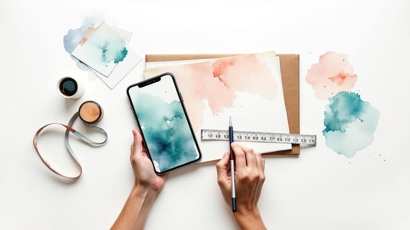
At its core, creating a mockup is all about bringing a design to life. You're taking a flat, static concept and dropping it into a real-world setting to show everyone how it will actually look and feel. This usually means placing your design onto a high-quality template—think a t-shirt, a phone screen, or even a massive billboard—so clients can truly visualise the final product.
 A truly great mockup is so much more than a pretty picture. It’s the essential bridge connecting your creative vision to your client’s reality. I like to think of it as the ultimate communication tool. It shifts a design from an abstract idea on a screen to something tangible and relatable that anyone can understand in an instant.
Honestly, this one step can be the difference between a project that sails through approvals and one that gets bogged down in endless, painful revisions.
Handing over a flat JPEG of a logo or an app interface often leaves too much to the imagination. It’s easy for clients to struggle with picturing how it fits into their world.
But when you showcase that same design on a realistic mockup—the logo on a business card, the app on a phone held by a person—you answer their unspoken questions before they even ask them. They don't just see a design; they see a solution in action. That clarity builds confidence and helps you get that crucial "yes" so much faster.
A compelling mockup does more than just display your work; it tells a story about how your design will live and function in the real world, making your ideas instantly more persuasive and valuable.
We've all been there: misunderstandings that lead to costly fixes. A client might love a web design, only to realise during development that it just doesn't feel right on a mobile screen. A well-executed mockup catches these potential problems early on.
It allows you to make cheap and easy tweaks during the design phase, not during the expensive coding or printing stage. This proactive approach saves time, money, and a whole lot of frustration for everyone involved.
Here in the UK, the ability to create fantastic mockups has become a cornerstone of the design industry. The demand for designers with this skill, especially in London's booming digital marketing and e-commerce scenes, shows just how valuable it is for cutting down on costly changes and making client presentations smoother.
Ultimately, it’s a non-negotiable skill that shows you’re a professional with foresight, turning your design process from reactive to strategic. Understanding what is visual storytelling is key here, as every mockup you create should tell a story about the purpose and potential of your design. See more at: https://instastock.studio/blog/what-is-visual-storytelling

An incredible mockup doesn't just happen by accident. The best ones—the kind that sail through approvals without endless revisions—are born from a solid plan. Think of it as drawing up the blueprint before you start building the house; a little bit of prep work now saves you a world of headaches later.
One of the most common pitfalls I see is jumping straight into a design tool without a clear direction. Before you even touch a colour picker or a font menu, you have to ask yourself one simple question: what is this mockup for? The answer to that question dictates your entire approach.
For instance, a mockup for an internal stakeholder meeting needs to clearly communicate how the design hits business goals. On the other hand, one for a developer handoff needs to be laser-focused on technical precision. And if you're making it for user feedback, the user flow and usability are what matter most. Nailing down the audience and objective is the first real step in learning how to create mockups that get the job done.
Once you know why you're building the mockup, it's time to gather your supplies. Trying to design without the right assets is like attempting to cook a gourmet meal with an empty pantry. It's frustrating, and the result is never quite what you envisioned.
I find it helps to create a quick checklist of everything you'll need. This simple step ensures you have all your ingredients ready to go, which makes the whole process feel much smoother.
Here's what should be on your asset checklist:
Getting these organised from the get-go prevents delays and makes sure your mockup is perfectly aligned with the project's needs right from the start. For a bit more structure, these handy design brief templates can really help streamline this part of the process.
With your purpose clear and your assets ready, the last piece of the planning puzzle is to map out the structure. You don't need any fancy software for this. A simple sketch on paper or a basic digital wireframe works perfectly.
The point here isn't to make it look pretty—it's all about placement and hierarchy. Where does the main headline go? How will the key visuals be arranged? What’s the main call-to-action, and where should it live to get the most attention?
This quick structural map forces you to think about the user's journey and the logical flow of information before you get lost in the visual details. It's what makes a design functional, not just beautiful.
This foundational work turns the design process from pure guesswork into a deliberate, strategic plan. By setting the stage properly, you’re not just hoping your mockup will look good—you're making sure it will achieve its specific goal with precision and impact.
With so many mockup tools popping up, it’s easy to get overwhelmed. But here’s a little secret from my years in the industry: you don’t need to know how to use all of them. Most of us find one or two that just click with our workflow and we stick with them. Let's dig into the modern designer's toolkit and find the right fit for you.
What you choose really boils down to what you're trying to build. Are you whipping up a gorgeous, photorealistic shot of your new coffee brand for your online shop? Or are you mapping out an interactive prototype for a mobile app? The end goal will point you to the perfect tool for the job.
For most designers I know, the conversation usually circles back to a handful of key players. Each one has its own personality and excels in different areas, so let’s get to know them.
At the end of the day, the "best" tool is the one that aligns with your skills, budget, and the specific demands of your project. Don't hesitate to take a few for a test drive.
To make things a bit clearer, here's a quick side-by-side look at how these tools stack up.
Choosing the right tool often comes down to the nitty-gritty features. This table compares some of the most important aspects of Instastock, Figma, and Adobe XD to help you see which one best suits your project's needs.
| Feature | Instastock | Figma | Adobe XD |
|---|---|---|---|
| Primary Use Case | AI-powered photorealistic mockups | UI/UX interactive prototyping | UI/UX interactive prototyping |
| Learning Curve | Very low | Moderate | Moderate |
| Collaboration | Asset sharing | Real-time, multi-user | Real-time co-editing |
| Best For | Product shots, branding, social media | Web/app design, user flows | Web/app design, Adobe ecosystem users |
| Unique Strength | Instantly generates unique scenes with AI | Superior collaboration features | Seamless Adobe Creative Cloud sync |
| Cost | Subscription-based | Freemium and subscription plans | Included in Creative Cloud |
Hopefully, that gives you a clearer picture. While Figma and Adobe XD are fantastic for interface design, Instastock really shines when you need to create compelling, realistic scenes for your products or brand assets without a heavy technical lift.
The design world is always moving, and right now, new technology is making it easier and faster than ever to learn how to create mockups. AI-driven tools, in particular, are smashing through creative roadblocks, unlocking a whole new level of realism and speed.
This isn't just a niche trend; it's a major shift happening across the board. The UK's graphic design market, which is valued at a hefty £1.9 billion in 2024, is rapidly embracing AI and 3D visualisation to streamline workflows and create far more impressive client presentations. You can read more about the future of graphic design in the UK on orionbyte.co.uk.
Using AI isn't about replacing creativity; it's about amplifying it. These tools take care of the tedious, technical bits, freeing you up to focus on what really matters: the big ideas and the overall design strategy.
Think about it this way. Instead of spending hours fiddling with shadows and perspectives to get a scene just right, you can now simply describe what you want and let an AI assistant do the heavy lifting in seconds. This opens the door to rapid iteration, allowing you to explore more creative avenues and ultimately deliver better work, faster. Choosing a tool that has these capabilities built-in can give you a serious leg up on the competition.

Right, let’s get to the fun part—turning your flat designs into something that looks and feels tangible. This is where a tool like Instastock really shines. It transforms the whole process of creating mockups from a technical headache into an actual creative exercise.
The journey begins with finding the perfect scene for your product. Forget scrolling through endless pages of generic, overused templates. Instastock’s real power is its ability to generate a completely unique backdrop tailored to your design.
Need to show your app on a phone screen at a sun-drenched café? Or your brand's logo on a t-shirt in a chic boutique? You just describe it, and Instastock brings that vision to life.
A great place to start is the Instastock asset library. I often browse through it just for inspiration. You'll find thousands of pre-generated scenes, from clean, minimalist tech setups to vibrant, busy lifestyle shots. It's a fantastic launching pad.
Once you find a template you like—or generate a new one from scratch—it’s time to upload your design. Instastock handles all the tricky perspective and lighting adjustments for you, blending your asset into the scene automatically. Honestly, this saves so much time compared to manually warping layers in Photoshop.
The secret to a mockup that people actually believe is all in the details. Don't just drop your design in and call it a day. Spend a few moments fine-tuning the lighting, shadows, and colours. It’s those little tweaks that create a truly photorealistic and convincing scene.
After your design is in place, the real magic begins. You can start refining the entire scene with simple text commands, almost like you're directing a photoshoot.
Here are a few adjustments I find myself making all the time:
This back-and-forth process lets you experiment quickly without needing a degree in 3D rendering. The goal is simple: make it look like your product was really there when the photo was taken.
For those of you working with 3D models, understanding the core principles of digital staging is crucial. If you want to take your designs from basic concepts to stunning visuals, this beginner's guide on how to render in SketchUp is an excellent resource.
By following this kind of workflow, you’re doing much more than just creating a basic mockup. You're essentially art-directing a photoshoot, making sure every element works together to tell a story. That’s how you create visuals that don’t just show your work—they sell it.

So, you’ve built a brilliant mockup. That’s a huge milestone, but the job isn't quite done yet. Now comes the part where you turn that great visual into an approved project: the refinement and presentation phase. This is where your hard work truly comes to life.
A powerful presentation is much more than a simple show-and-tell. It’s your chance to tell the story behind your design. You need to connect the dots for your stakeholders, showing them exactly how your visual choices solve their problems and align with the project goals.
The feedback stage can feel a bit nerve-wracking, but I’ve learned to see it as a chance to collaborate, not a test of my abilities. The trick is to steer the conversation away from vague opinions and towards genuinely helpful insights.
Instead of asking a closed question like, "Do you like it?", I try to prompt more thoughtful responses.
Asking questions like these gets stakeholders thinking about function, not just aesthetics, which leads to far more useful feedback. Once the notes start rolling in, I group them to spot any recurring themes. This helps me focus on the changes that matter most, rather than getting bogged down in minor personal preferences.
Never just throw a mockup on the screen without any introduction. I always kick things off by quickly recapping the project goals and the specific problem we're trying to solve. This simple step immediately frames your design as a strategic solution, not just a pretty picture.
Then, walk them through your creative journey. Explain the why behind your decisions. For instance, you could say, "I chose this vibrant lifestyle photo because it evokes a sense of energy and really speaks to our target demographic." This context is what builds trust and gets everyone on board.
Your presentation should be a guided tour of your design decisions. By explaining the 'why' behind the 'what', you build confidence and demonstrate the strategic thinking that justifies your creative choices.
Once the revisions are done and you’ve got the green light, it’s time to prep the final files. The right format and resolution will depend entirely on where the mockup is heading.
The UK's creative software market is booming, with projected spending set to hit around US$5.02 billion by 2025. This huge investment in tools like Figma and Adobe XD just goes to show how essential professional mockups have become. Nailing these final steps is what separates good work from great work, ensuring your designs meet professional standards and make a real impact.
As you start diving into creating mockups, you'll probably find a few questions popping up again and again. It's totally normal. Let's walk through some of the most common ones I hear, so you can get back to designing with confidence.
It’s so easy to get these terms tangled up, but they’re actually just different stops on the same design journey. Think of it as evolving an idea from a rough sketch to a working model.
Wireframe: This is your basic blueprint. It’s a simple, black-and-white outline that maps out the structure and where everything goes. The focus is purely on layout, not on looks.
Mockup: This is the visual stage. It’s a static but detailed image that shows exactly what the final thing will look like—we're talking colours, fonts, images, the whole shebang.
Prototype: This is where it gets interactive. A prototype is a clickable, high-fidelity simulation that lets people actually test out the design and get a feel for how it works before a single line of code is written.
Knowing the difference helps you pick the right tool for the job and communicate clearly with your team or clients.
Realism is the secret sauce that sells your design. It’s what separates a flat, pasted-on image from a scene that looks like your work truly belongs there.
First things first, always start with high-quality templates and images. A blurry background is an instant giveaway. Then, pay close attention to the little things, like lighting and shadows. Does your design cast a shadow that matches the main light source in the photo? Tools with smart objects or AI-powered placement are brilliant for this, as they handle perspective and texture automatically.
Don't skip over the tiny details, either. A subtle screen glare, the texture of the fabric it's on, or a faint reflection can make all the difference.
The goal is to fool the eye into thinking your design was actually in the room when the photo was taken. Consistency is everything—make sure your design’s colours and lighting blend naturally with the environment.
This is a big one. It feels generous to show a client every single idea you came up with, but trust me, it usually just causes confusion and decision paralysis. The sweet spot is presenting two to three distinct, well-thought-out concepts.
Each option should be strong enough to stand on its own and offer a slightly different solution to their problem. When you present them, don't just drop the images in their lap. Briefly explain the thinking behind each one. This guides the conversation, helps them make an informed choice, and shows just how much consideration you've put into their project.
You absolutely can! While the big guns like Photoshop or Figma are fantastic, they have a serious learning curve and a price tag to match. Thankfully, there are now some amazing browser-based tools built for exactly this purpose.
Platforms like Instastock or Canva are perfect examples. They give you access to massive libraries of professional templates where you just need to upload your design and tweak the scene. They're a fantastic starting point for anyone who needs a brilliant mockup without the technical headache.
Ready to ditch the complicated software and start creating beautiful, realistic mockups in minutes? With Instastock, you can generate unique scenes, place your designs perfectly, and fine-tune it all with simple text prompts.
Create your first five images for free at Instastock and discover just how easy it is to bring your creative vision to life.
What is omnichannel marketing? Learn how to build a seamless customer experience that drives loyalty and growth for your UK business with this practical guide.
Your complete guide to social media image dimensions. Get the latest sizes and best practices for Instagram, Facebook, X, and LinkedIn to optimize your content.

Stuck for inspiration? Discover 12 fresh social media content ideas to boost engagement and grow your audience, with tips for creating stunning visuals.