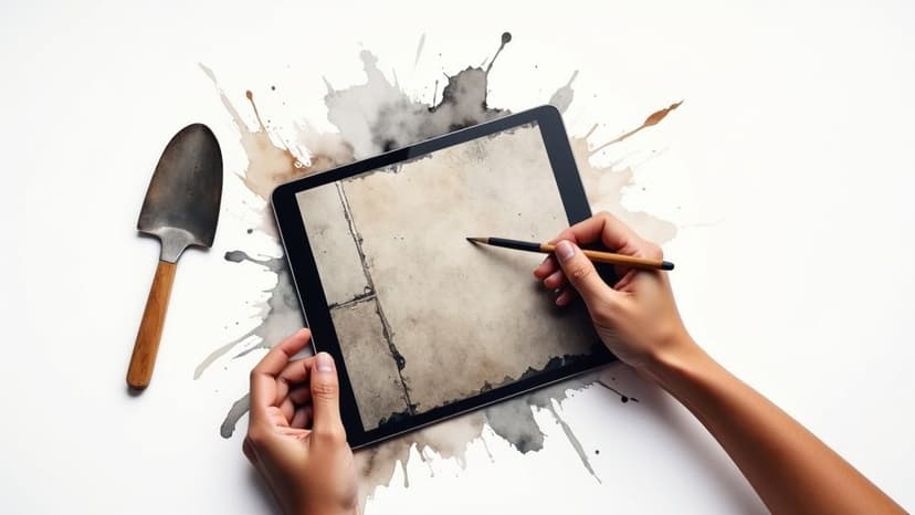
Create Perfect Seamless Concrete Texture with AI
Learn to create a flawless seamless concrete texture with AI. This guide offers practical tips, from writing better prompts to real-world application.
October 16, 2025•10 min read
Explore stunning black and white abstract backgrounds for 2025. Discover creative designs to elevate your projects and make a bold visual impact.
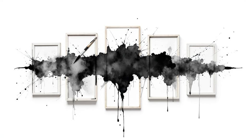
Instastock Team
October 15, 2025 • 14 min read
Tired of generic visuals that fail to make an impact? The right background can transform a good design into an unforgettable one. A black and white abstract background isn't just a placeholder; it's a powerful tool for conveying mood, sophistication, and modernity. In a world saturated with colour, monochrome commands attention through its raw, unfiltered power. It creates visual space, enhances typography, and establishes a timeless aesthetic that works across countless applications, from sleek corporate websites to bold fashion lookbooks.
This guide moves beyond simple inspiration. We will explore eight distinct styles of monochrome abstracts, offering deep strategic analysis and actionable takeaways for each one. We’ll show you not only how to choose the perfect style for your project but, more importantly, how to recreate unique, fully-owned versions in seconds using Instastock’s AI editor. While our focus is on static designs, understanding how these principles apply to motion is also crucial. For those interested, it's useful to learn how to make backgrounds for animation to see how dynamic elements can further elevate your creative work.
Ready to unlock the dramatic potential of black and white? Let's dive into the examples.
Geometric pattern abstracts leverage the power of precision and order. They use fundamental shapes like circles, squares, and lines, arranging them in structured or seemingly random compositions to create a sense of harmony and intellectual rigour. This style taps into the mathematical beauty of form, where the high contrast of a black and white abstract background elevates the design, making the structural elements pop with a clean, modern energy.

This approach is rooted in influential design movements like Bauhaus and the Swiss Design style, which championed clarity and function. Today, it’s a go-to for tech companies like Stripe and corporate giants using Microsoft and Google Slides templates, as it conveys sophistication, stability, and forward-thinking innovation.
The magic of geometric patterns lies in their psychological impact. The brain is naturally drawn to recognising patterns, and the clean lines and predictable shapes of a geometric design create a feeling of order and trustworthiness. This makes it an incredibly effective choice for brands that want to project competence and reliability.
Strategic Insight: Use geometric patterns to build a visual foundation of trust and precision. The clean, organised nature of these designs subconsciously tells your audience that your brand is methodical, dependable, and modern.
Ready to create your own geometric masterpiece? Here’s how you can replicate this look with strategic precision:
Minimalist black and white abstract background, Bauhaus-inspired repeating semi-circle pattern, sharp lines, high contrast, clean vector art. This will give you a solid starting point for a professional-looking design.Marble and fluid texture abstracts capture the organic elegance of natural patterns. They mimic the intricate, swirling veins of stone or the dynamic flow of liquid, creating a sense of sophisticated movement. This style uses the interplay of black and white to produce a black and white abstract background that feels both luxurious and elemental, adding a layer of depth and high-end appeal to any design.

This aesthetic was popularised by luxury brands like Chanel and Tom Ford, who used its opulent feel in their packaging and campaigns. It’s a favourite for high-end cosmetics, premium stationery, and boutique hotel branding, as it instantly communicates quality and natural grace. Its organic nature provides a softer, more artistic alternative to rigid geometric designs.
The allure of marble and fluid textures lies in their connection to the natural world. These organic, unpredictable patterns are inherently beautiful and soothing, creating a visual experience that is both calming and captivating. This makes them perfect for brands aiming to evoke a sense of premium quality, artistry, and timeless elegance without appearing stiff or overly corporate.
Strategic Insight: Use fluid and marble textures to associate your brand with luxury, nature, and artistry. The flowing, organic lines create a feeling of bespoke quality and calm sophistication, making your visuals feel both exclusive and grounded.
Looking to infuse your project with organic luxury? Here’s how to master the fluid look:
Elegant black and white abstract background, macro liquid marble texture, organic swirling ink patterns, high contrast, soft focus, sophisticated and luxurious. This will give you a beautiful, high-end texture to work with.Ink splatter and brush stroke abstracts capture the spontaneous, expressive nature of traditional painting techniques. These designs feature dramatic splashes, drips, and gestural marks that convey raw energy, creativity, and artistic authenticity. This style transforms a simple black and white abstract background into a dynamic canvas, where the high contrast between the uncontrolled ink and the clean space creates bold, attention-grabbing compositions.

This aesthetic has deep roots in the Abstract Expressionist movement, popularised by artists like Jackson Pollock. Its influence extends to street art, high fashion, and graphic design, seen in everything from creative agency portfolios to music festival posters. It’s perfect for brands in the arts, fashion, and music industries that want to communicate a rebellious, handcrafted, and authentic spirit.
The appeal of this style lies in its controlled chaos. The untamed nature of splatters and strokes feels human and imperfect, breaking away from sterile digital perfection. This raw quality evokes emotion and movement, making the design feel alive and immediate. It’s an effective way for brands to showcase their creative side and connect with audiences on a more visceral level.
Strategic Insight: Use ink splatters and brush strokes to inject a dose of authentic, human energy into your brand. This style tells your audience that you are bold, creative, and not afraid to break the rules, which is perfect for building an edgy and memorable identity.
Ready to make a splash with your own design? Here’s how to channel your inner artist for maximum impact:
Expressive black ink splatter on a clean white background, Japanese sumi-e style, high contrast, dynamic brush strokes, minimalist abstract art.Line art and contour abstracts use continuous or broken lines to suggest forms, movement, or pure aesthetic patterns. These minimalist backgrounds rely on the elegance of line weight, spacing, and direction to create sophisticated visual interest without overwhelming complexity. The simplicity of a black and white abstract background enhances this style, resulting in clean, contemporary designs that feel both artistic and refined.

This aesthetic is heavily influenced by minimalist artists like Ellsworth Kelly and Scandinavian design movements. It's now a hallmark of modern branding, seen in editorial illustrations for publications like The New Yorker, the branding of tech companies such as Airbnb, and minimalist packaging for premium beauty products. It communicates a sense of effortless sophistication and creative intelligence.
The power of line art lies in its ability to do more with less. By simplifying forms down to their essential outlines, these designs engage the viewer's imagination, inviting them to fill in the details. This minimalist approach feels intentional and uncluttered, creating a sense of calm and focus that directs attention to the core message or product.
Strategic Insight: Use line art and contour abstracts to convey elegance and intellectual creativity. The clean, flowing lines suggest a brand that is thoughtful, modern, and values the beauty of simplicity.
Want to harness the understated power of line art? Here’s how to create a polished and elegant design:
Minimalist black and white abstract background, continuous line art of a face profile, single delicate line, high contrast on a clean white canvas, Scandinavian design style. This will provide an elegant and modern visual to build upon.Noise and grain texture abstracts add a layer of atmospheric depth by simulating the appearance of classic film grain or digital noise. This style uses countless tiny black and white dots distributed across the canvas, creating a subtle or pronounced texture that introduces a sense of vintage character and tactile quality to an otherwise flat digital space. This black and white abstract background is perfect for adding a nostalgic or moody feel.
This aesthetic has its roots in analogue photography and has been popularised by the visual styles of indie film, lo-fi music culture, and design studios focused on retro aesthetics. It’s frequently used for music album artwork, photography portfolios, and brand identities that want to convey an authentic, handcrafted, or artistic sensibility.
The appeal of noise and grain lies in its ability to add organic imperfection to a sterile digital medium. This texture feels human and tangible, evoking emotions tied to nostalgia and authenticity. It softens harsh digital lines and adds a layer of visual interest that makes the entire composition feel more sophisticated and emotionally resonant.
Strategic Insight: Use noise and grain to infuse your designs with personality and a sense of analogue warmth. This texture breaks the digital mould, making your visuals feel more authentic and emotionally engaging, which is ideal for connecting with audiences on a deeper level.
Looking to add some vintage charm to your background? Here’s how to apply noise and grain effectively:
Subtle film grain texture on a dark grey background, monochromatic noise, moody and atmospheric, cinematic quality, black and white abstract background.Halftone and dot pattern abstracts cleverly use varying sizes and densities of dots to build gradients, textures, and images. Inspired by vintage print reproduction, this technique creates a distinctive retro-modern aesthetic that feels both nostalgic and digital. The high contrast of a black and white abstract background makes these dot patterns particularly striking, offering a unique sense of depth and visual interest through systematic, mesmerising arrangements.
This style was famously popularised by Pop artists like Roy Lichtenstein and Andy Warhol, who brought the mechanics of commercial printing into the world of fine art. Today, it’s a favourite for streetwear brands, comic book creators, and event promoters, as it injects a cool, graphic, and slightly gritty personality into any design.
The appeal of halftone patterns is rooted in their optical trickery. From a distance, the dots merge to form a cohesive image or gradient, but up close, the mechanical structure is revealed. This duality creates a dynamic viewing experience that feels tactile and engaging, making it an excellent choice for brands that want to convey a sense of edge, creativity, and pop-culture awareness.
Strategic Insight: Use halftone patterns to add texture and a retro-graphic feel to your designs. The style communicates an appreciation for analogue art forms while remaining perfectly suited for modern digital media, making your brand look both cultured and current.
Ready to give your designs a pop-art punch? Here’s how to master the halftone effect:
Black and white pop art background, abstract halftone dot pattern, varying dot sizes creating a gradient effect, high contrast, graphic novel style, vector. This will provide a fantastic foundation for a bold, textured design.Optical illusion and moiré pattern abstracts play with perception, using precise arrangements of lines and shapes to create the illusion of movement, depth, and vibration. These mesmerising designs exploit how our eyes process conflicting visual information, resulting in dynamic effects that seem to shift and pulse. A black and white abstract background intensifies these effects, making the visual trickery even more potent and captivating.
This style has its roots in the Op Art movement of the 1960s, with pioneers like Bridget Riley creating artworks that challenged visual perception. Today, it’s embraced by tech conferences, music festivals, and cutting-edge fashion brands to create immersive and unforgettable visual experiences that feel futuristic and highly engaging.
The power of optical illusions lies in their ability to actively engage the viewer's brain. Unlike static images, these patterns demand cognitive participation, making them incredibly memorable and difficult to ignore. This creates a powerful hook, drawing audiences in and holding their attention in a crowded digital landscape.
Strategic Insight: Use optical illusions and moiré patterns to create an unforgettable, high-energy brand experience. This style is perfect for forward-thinking brands that want to be perceived as innovative, dynamic, and a little bit disruptive.
Ready to bend reality with your own designs? Here’s how to use this effect without overwhelming your audience:
Black and white moiré pattern abstract background, intersecting hypnotic lines creating optical illusion, high contrast, minimalist, vector style, vibrating effect.Photographic high-contrast abstracts transform real-world photographs into stark black and white compositions by eliminating mid-tones and pushing contrast to the extreme. This technique converts recognisable subjects like architecture, nature, or figures into abstract patterns of pure black and white, creating dramatic, graphic interpretations that blend photographic realism with powerful abstract design.
Pioneered by iconic photographers like Daido Moriyama and brought into the mainstream by designers like Neville Brody, this style is a staple in high-fashion lookbooks, architectural portfolios, and editorial spreads. Its raw, unfiltered energy gives it a timeless edge, making it perfect for brands aiming for an artistic, bold, and sophisticated aesthetic.
This method leverages the inherent structure of reality but strips it down to its most basic forms, creating a powerful emotional impact. The high contrast removes distractions, forcing the viewer to focus on shape, light, and shadow. It turns a simple photograph into a piece of art that feels both familiar and entirely new, making it a compelling black and white abstract background for storytelling.
Strategic Insight: Use high-contrast photographic abstracts to infuse your brand with a sense of artistic depth and drama. By abstracting reality, you create a powerful visual hook that is both sophisticated and emotionally resonant, inviting deeper engagement with your message.
Want to turn everyday photos into striking abstract art? Here’s how to master the high-contrast look:
High-contrast black and white abstract background, silhouette of a brutalist building, extreme shadows, grainy film texture, graphic and minimalist.| Abstract Style | Implementation Complexity 🔄 | Resource Requirements ⚡ | Expected Outcomes 📊 | Ideal Use Cases 💡 | Key Advantages ⭐ |
|---|---|---|---|---|---|
| Geometric Pattern Abstracts | Moderate 🔄 (requires precise design and balance) | Low ⚡ (vector-based, scalable) | Clean, modern, professional; strong visual rhythm 📊 | Corporate presentations, tech UI, fashion branding | Versatile, scalable without quality loss, timeless ⭐ |
| Marble and Fluid Texture Abstracts | High 🔄 (complex organic patterns) | High ⚡ (high-res files, large size) | Luxurious, sophisticated, unique textures 📊 | Luxury packaging, weddings, spa marketing | Conveys elegance and uniqueness ⭐ |
| Ink Splatter and Brush Stroke Abstracts | Moderate 🔄 (requires artistic execution) | Moderate ⚡ (texture detail, layering) | Expressive, energetic, emotional impact 📊 | Music festivals, creative agencies, fashion campaigns | Highly expressive, creative appeal ⭐ |
| Line Art and Contour Abstracts | Low 🔄 (minimalist, requires precision) | Low ⚡ (small file sizes) | Clean, modern, minimalist, sophisticated 📊 | Minimalist branding, editorial, tech marketing | Extremely versatile, easy to reproduce ⭐ |
| Noise and Grain Texture Abstracts | Low to Moderate 🔄 (pattern generation) | Moderate ⚡ (file size depends on grain density) | Atmospheric, vintage, textured backgrounds 📊 | Photography portfolios, vintage branding, indie music | Adds subtle texture without overwhelm ⭐ |
| Halftone and Dot Pattern Abstracts | Moderate 🔄 (dot arrangement and size management) | Moderate ⚡ (variable density control) | Retro-modern, bold graphic texture 📊 | Retro branding, comics, concert posters | Bridges vintage and modern design ⭐ |
| Optical Illusion and Moiré Pattern Abstracts | High 🔄 (precise geometry and optical effects) | Moderate ⚡ (can be resource intensive) | Eye-catching, dynamic, memorable effects 📊 | Event branding, tech companies, art installations | Unique, sophisticated, highly shareable ⭐ |
| Photographic High-Contrast Abstracts | High 🔄 (requires quality photos and editing) | High ⚡ (source materials and processing) | Dramatic, graphic abstraction blending realism 📊 | Editorial design, fashion campaigns, architectural portfolios | Combines realism with abstraction, highly customizable ⭐ |
You've now explored the full spectrum of monochrome design, from the clean, corporate lines of geometric patterns to the raw energy of ink splatters and the sophisticated allure of fluid marble textures. We've journeyed through eight distinct styles, breaking down not just what they are, but why they work and how you can use them to elevate your own creative projects. The most critical takeaway is this: a black and white abstract background isn't about removing colour; it's about amplifying everything else.
By embracing this focused palette, you gain unparalleled control over mood, focus, and message. Simplicity becomes a powerful tool for clarity, allowing your text, products, or key visuals to command attention without competition. The strategic use of contrast, texture, and form is what separates a forgettable design from an iconic one.
Now, it’s time to put these powerful concepts into practice. The true magic happens when you move from admiring these styles to creating them yourself, tailored perfectly to your brand’s unique voice. Consider the core feeling you want to evoke:
The goal is to stop searching for the "perfect" background and start creating it. With the power of AI, you are no longer limited by stock libraries. You can become the architect of your own visual language. For designers interested in leveraging artificial intelligence for their creations, understanding the principles of mastering AI prompts is key to effectively generating specific and stunning black and white abstract designs. By learning to communicate your vision precisely, you can guide the AI to produce exactly what you need in seconds.
Ultimately, mastering the black and white abstract background is about understanding visual strategy. It's about recognising that stripping away colour can add layers of meaning, sophistication, and impact. You're now equipped with the knowledge to make deliberate, powerful design choices that resonate with your audience and make your brand unforgettable.
Ready to bring your monochrome vision to life? With Instastock, you can generate any of the background styles discussed in this article using simple text prompts. Stop searching and start creating a unique black and white abstract background for your brand in seconds by visiting Instastock and claiming your free images today.
Learn to create a flawless seamless concrete texture with AI. This guide offers practical tips, from writing better prompts to real-world application.

Want to design your own Christmas card? Our guide shows you how to use AI tools to create beautiful, custom holiday cards your family and friends will treasure.

A friendly guide to creating beautiful AI Christmas scene images. Learn the prompts, tools, and tricks to bring your festive ideas to life in stunning detail.