
How to Create Mockups That Impress Your Clients
Learn how to create mockups that win projects. This guide covers planning, tool selection, and presentation tips for designers.
November 2, 2025•13 min read
Learn to generate any pastel pink background you can imagine. This guide covers easy AI prompts, expert tips, and creative ideas to master your designs.
Instastock Team
November 4, 2025 • 9 min read
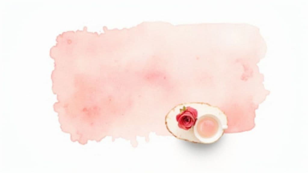
A good pastel pink background can bring an instant sense of warmth, calm, and a bit of modern sophistication to pretty much any project. It’s a wonderfully versatile colour that just works, whether you’re developing a brand identity or designing social media posts, creating a feeling of gentle elegance. The real trick, of course, is knowing how to generate one that perfectly captures your vision.
Before we jump into the creative side of things, it’s worth taking a moment to appreciate why this gentle hue is so compelling. A pastel pink background is more than just a pretty colour; it's a powerful design tool with some fascinating historical and psychological roots. Understanding this will help you be much more intentional when you start creating your own visuals.
The appeal of soft pink is definitely not a new thing. Its use in British interior design actually goes all the way back to the late 18th century, where it was a symbol of status in grand neo-classical interiors. You can see great examples of this in places like Brighton's Royal Pavilion. If you’re curious, you can learn more about the Pink Pavilion's history. This long history gives the colour a timeless, classic feel that’s hard to replicate.
Colour psychology tells us that soft, muted pinks tend to have a calming effect on people. It's a world away from its louder, more energetic cousin, hot pink. Instead, pastel pink is closely associated with:
This unique blend of classic elegance and modern appeal is what makes a pastel pink background so incredibly versatile. It can feel both traditional and contemporary, all depending on how you use it.
For a modern twist, try pairing your pastel pink with a clean, subtle gradient. A gentle transition from light to dark can add depth and visual interest without overpowering your design, making it perfect for minimalist projects.
Because the colour is so soft, it also makes an ideal canvas. It beautifully supports text, product photos, and other graphic elements without stealing the spotlight, ensuring your main subject always remains the hero of the design. To see how gradients can really elevate your work, have a look at our guide on creating a 3D subtle gradient background.
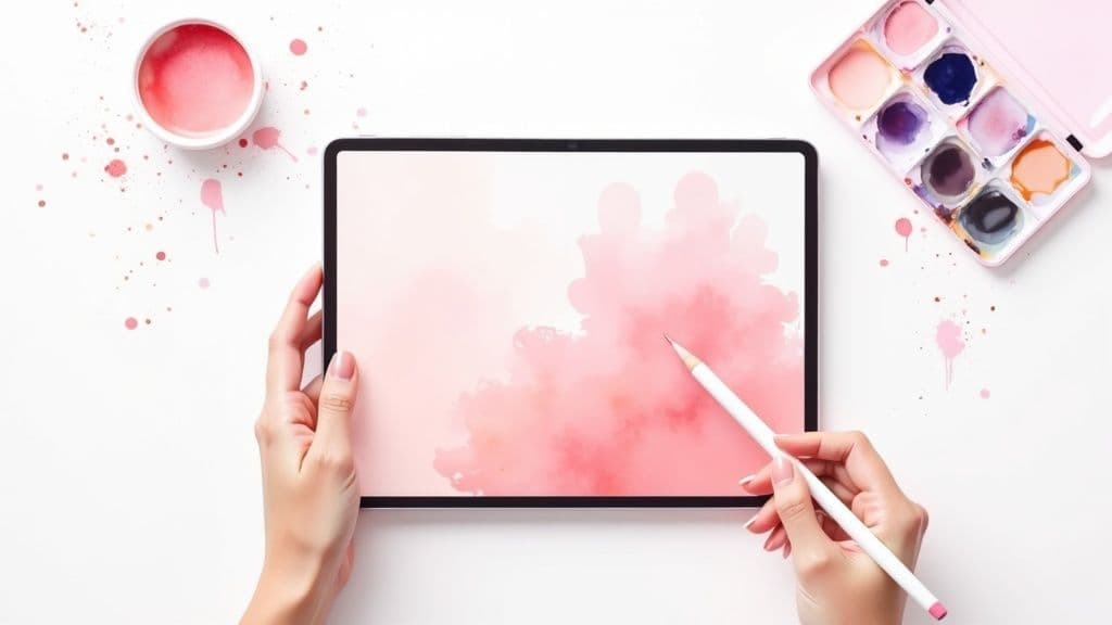
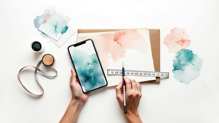
Ready to see some magic happen? Creating your first AI image is way less intimidating than it sounds. We'll jump straight into the fun part: writing simple text prompts that get you beautiful results right away.
The heart and soul of any AI art generator is the prompt box. This is where you tell the AI what’s in your head. For now, let’s keep it simple. The goal is to give the AI two crucial pieces of information: what you want (the subject) and what it should look like (the colour).
Let's start by making a classic pastel pink background. Honestly, the most direct approach usually works best. Head over to the prompt box in Instastock and let’s type in a few ideas.
You can copy and paste these to see what happens:
a simple pastel pink backgroundsoft pastel pink textured backgroundplain light pink background, pastel, minimalistSee the difference? The first prompt is as straightforward as it gets. The second one asks for a bit of texture, and the third uses style keywords like "minimalist" to nudge the AI in a specific direction. I recommend trying all three to get a feel for how the AI responds to subtle changes in your wording.
Don't stress about nailing it on the first attempt. The real power of AI comes from trying things out. Generate a few images, see what you like, and tweak your next prompt from there. It's all part of the creative process.
As you get more confident, you can explore the wider world of AI image tools for visual content creation to see what else is possible. These simple prompts are your starting point, but if you're ready to learn more, our full guide on how to generate images with AI is the perfect next step.
https://instastock.studio/blog/how-to-generate-images-with-ai
Right, this is where the real fun begins. Now you've got the hang of the basic commands, we can start looking at how a few extra words can turn a simple pastel pink background into something genuinely special. It's all about layering your descriptions to nudge the AI towards the specific mood and style you're after.
Think of your prompt as a recipe. "Pastel pink background" is your core ingredient, but the magic happens when you start adding different flavours. We can bring in words that hint at a feeling, a texture, or an overall artistic vibe.
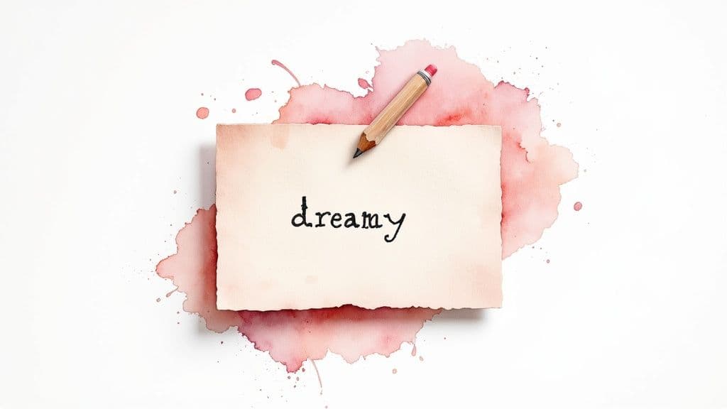
Let's start with emotion. What's the feeling you want your background to give off? Just one well-chosen adjective can completely change the game.
Just compare a prompt like soft pastel pink background to dreamy glowing pastel pink background. That second one immediately gives the AI so much more to work with, leading to a far more interesting and dynamic image.
Next up, let’s think about the surface itself. Are you picturing something perfectly smooth, or does it have a bit of character? This is where texture and style keywords are your best friends. A textured background adds a depth and tactile feel that a flat colour just can't match.
My Go-To Tip: Combining style and texture keywords is a seriously powerful technique. A prompt like
minimalist pastel pink background with a subtle grain texturegives the AI incredibly precise instructions, which almost always leads to a refined, high-quality result.
It’s interesting to note that the desire for textured wallpapers isn’t new; it really took off in the Victorian era. By the 1850s, UK manufacturers were responding to a huge demand for softer interiors, with pink designs shooting up by roughly 40% between 1850 and 1880. This shift helped make the pastel pink background an accessible and popular choice in home décor. You can dive deeper into this design history by exploring the Victoria and Albert Museum’s collection.
Here’s a quick-reference table I put together to show how different keywords can shape your final image.
Use this quick-reference table to see how adding specific keywords to your prompt can influence the style and texture of your generated background.
| Desired Effect | Keyword Examples | Best For |
|---|---|---|
| A Sense of Touch | linen texture, subtle grain, brushed canvas | Adding physical depth and a handmade feel. |
| Artistic Flair | watercolour wash, gouache, impasto | Creating painterly, creative backdrops for posts. |
| Modern & Clean | minimalist, scandi design, bauhaus style | Sleek, uncluttered visuals for product mockups. |
| Vintage Charm | art deco, faded, distressed | Evoking a nostalgic or retro aesthetic. |
By layering these kinds of elements, you can create a completely unique pastel pink background for pretty much any situation, whether it’s for a clean product shot or a rich, artistic social media story. Get experimenting
Alright, you've got a few images from the generator. They're probably pretty good, but now it’s time for those little adjustments that take a background from decent to dazzling. This is where a bit of human touch can really elevate the AI's work.
One of the most useful tricks in your toolkit is the negative prompt. Think of it as telling the AI precisely what to leave out. Say your lovely abstract pink background has some weird, dark blotches or random geometric shapes popping up. No problem. Just add a negative prompt like --no dark spots, shapes to your command. It's a surprisingly effective way to tidy up the final result and get rid of any visual clutter.
Once you have an image that’s about 90% of the way there, it’s time to jump into a photo editor. You don’t need anything fancy; even the most basic tools can make a huge difference.
Often, the AI gets close on the colour but doesn't quite nail the shade you had in mind. A quick tweak of the saturation or hue can shift a standard pink to that perfect dusty rose or soft, muted blush you were picturing. Personally, I find that dialling the saturation down just a touch often gives the image a more elegant, sophisticated feel.
Here’s another little secret: add a subtle vignette. Gently darkening the very edges of the background helps to pull the viewer's eye towards the centre. It’s a small detail that adds a professional-looking polish and makes the whole image feel more intentional.
Remember, the point of editing isn't to rescue a bad image, but to perfect a good one. It's these minor adjustments to colour and focus that give your AI creations that final, human-curated finish.
Need more than one background for a project? For things like branding, consistency is everything. An easy way to achieve this is by reusing the same image seed – the starting number the AI uses for its random generation – across a few different prompts.
Using the same seed means that even if you change other parts of the prompt, the core style, colour palette, and overall vibe will stay consistent. It's brilliant for creating a whole family of visuals that feel connected. You could easily generate a full branding package this way:
By sticking with a consistent seed and a similar prompt structure, you’ll end up with a set of backgrounds that look like they were made for each other, giving your project a polished and unified feel.
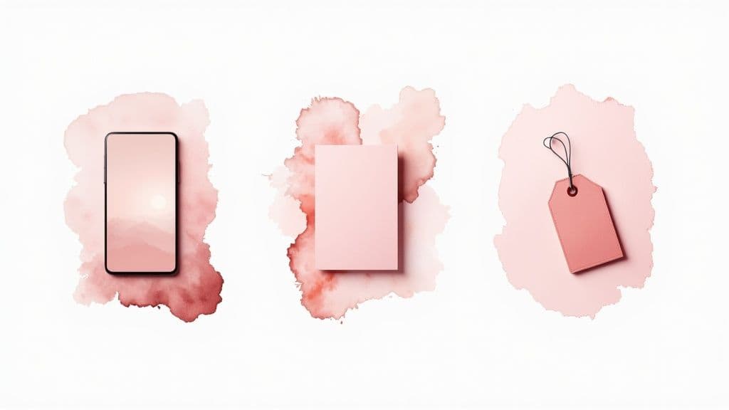
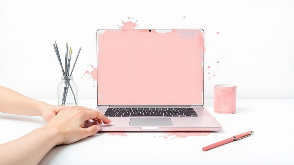
Okay, you've generated a gorgeous collection of pastel pink backgrounds. Now for the fun part—actually using them! The beauty of a soft pink canvas is its sheer versatility; it can elevate just about any project, from a quick phone customisation to a full-blown professional rebrand.
A simple, smooth pastel pink background is my go-to for anything with a lot of text. It's perfect for things like branded presentation slides or as the base for quote graphics on Instagram. The gentle colour lets your message take centre stage while adding a subtle touch of warmth and professionalism.
The possibilities here really are endless. I've found that a textured background with a bit of grain or a watercolour effect makes a stunning feature image for a blog post or even an elegant digital invitation.
Here are just a few ideas to get your creative juices flowing:
There’s a reason this colour has stuck around for so long. Its modern revival, which you might know as ‘Millennial Pink’, became a massive design staple in the 2010s. It wasn't just digital, either—a 2016 survey found that 35% of renovating UK homeowners used pastel pink, loving its modern warmth. You can read more about how the colour has stayed popular on Houzz.co.uk.
The key is to match the texture and shade to the purpose. A simple background is perfect for clean, corporate branding, while a more artistic, textured version can add a unique and personal touch to your creative projects.
Ultimately, these backgrounds are a creative playground. Don't be afraid to experiment and see how a touch of pink can bring a fresh, modern look to your work.
As you start playing around with creating that perfect pastel pink background, you're bound to run into a few tricky spots. It happens to everyone! Let's walk through some of the most common questions so you can get back to creating without any roadblocks.
So you've got a very particular colour in mind – maybe more of a 'dusty rose' than a generic 'pink'. Getting the AI to see what you see can be a challenge, but you have a few options.
A neat trick, though not supported by every tool, is to include the colour's HEX code directly in your prompt. Something like, a background in colour #FADADD. It's definitely worth a shot!
If that doesn't work, get super descriptive with your words. Think like an artist. Instead of just "pink," try guiding the AI with prompts like these:
pale blush with a hint of peachmuted dusty rose pinksoft baby pinkHonestly, my go-to method is often to generate a few decent options and then pop my favourite into a simple photo editor. A quick hue adjustment usually gets me to that exact shade I was picturing in my head.
Ah, the dreaded blurriness. This usually boils down to one of two culprits: your prompt or the generator's settings. If you throw too many conflicting ideas into your prompt, the AI can struggle to focus on a single, clear image. My advice? Keep your instructions simple and direct.
A pro tip for better quality is to always look for resolution or 'upscaling' options. A lot of generators will show you a lower-res preview first and then give you the chance to create a high-definition version. You can also nudge the AI in the right direction by adding terms like '4k', 'high resolution', and 'sharp focus' to your prompt.
This is a biggie, and the answer is: it depends entirely on the AI tool you're using. You can't just assume it's okay. Each platform has its own rules about commercial use, and they can vary wildly.
Some tools are fantastic and give you completely royalty-free images you can use for anything. Others will have different subscription levels or specific licensing agreements you need to stick to. Before you ever use a generated image for your business, do your homework. Always take a minute to read the platform's 'Terms of Use' or 'Licensing' page to make sure you're in the clear.
Ready to create stunning, unique visuals without getting tangled up in licensing worries? Give Instastock a try today and generate your first five images completely free. Get started at Instastock.studio.
Learn how to create mockups that win projects. This guide covers planning, tool selection, and presentation tips for designers.

What is omnichannel marketing? Learn how to build a seamless customer experience that drives loyalty and growth for your UK business with this practical guide.
Your complete guide to social media image dimensions. Get the latest sizes and best practices for Instagram, Facebook, X, and LinkedIn to optimize your content.