How to crop image in illustrator: The easy way
Master how to crop image in illustrator with simple steps, masks, artboards, and Pathfinder tips for clean, precise results.
November 18, 2025•10 min read
Learn how to design a poster for sales that actually drives results. Get practical tips on design, copywriting, and strategy using Instastock.

Instastock Team
November 19, 2025 • 13 min read
In a world overflowing with digital noise, a well-designed sales poster is a secret weapon. It’s a real, physical piece of marketing that can’t be swiped away or blocked by an ad filter. It has the power to stop people in their tracks and get them to act.
So, how do you create one that genuinely works? This guide is your roadmap. We'll dive into everything from figuring out who you're talking to and what you want to say, to mastering the visual tricks that make a poster truly pop. You'll even get practical tips on writing snappy copy and using AI prompts in Instastock to find the perfect imagery.
By the end, you'll know exactly how to design a poster that not only looks fantastic but also gets results, whether it’s professionally printed or shared online.
It might seem old-school, but the physical nature of a poster is exactly what makes it so effective. It commands attention in a way a fleeting digital ad simply can't.
Think about it: in the UK alone, traditional billboards and static posters still make up a whopping 40% of all out-of-home (OOH) advertising spend. That's a massive investment, and it's because they work. They have a proven track record in high-traffic areas, which you can read more about in these market trends on outdoor advertising.
Even historical posters teach us valuable lessons. Take a look at this classic from the early 20th century:

The core principles are all there: a clear visual focus, bold text that's easy to read from a distance, and a single, memorable image. The goal was to get a message across instantly, and that’s a lesson that still holds true for any sales poster you create today.
To get started, let’s quickly break down the most crucial parts of a poster that sells. I've put them into a simple table you can use as a checklist.
| Element | Purpose | Best Practice |
|---|---|---|
| Headline | Grab attention instantly. | Use 5-10 powerful words that state the main benefit or offer. |
| Visuals | Create an emotional connection. | A single, high-quality image or graphic is more effective than clutter. |
| Copy | Persuade and inform. | Keep it brief, scannable, and focused on solving a customer's problem. |
| Call to Action | Tell people what to do next. | Use strong verbs like "Shop Now," "Visit Us," or "Scan to Win." |
| Branding | Build recognition. | Place your logo and brand colours where they're visible but not distracting. |
Keep these five elements in mind as we go through the design process. They are the building blocks of a poster that doesn't just get noticed, but gets people to take action.
Before you even dream up a colour scheme or pick a font, let's get down to brass tacks. The absolute first step—the one that makes or breaks any sales poster—is knowing precisely who you're talking to. Flinging a generic message out into the world and hoping it sticks is a recipe for failure. The real secret to a poster that actually sells is to go deeper than surface-level demographics and get to the heart of what your customers truly want.
Think of it like this: are you selling high-end, organic skincare? Your audience isn't just "women aged 25-40." They're probably people who care about the planet, see self-care as a vital ritual, and are happy to pay a bit more for quality ingredients. So, your poster shouldn't just scream "50% Off." It should whisper things like "pure," "nourishing," or "ethically sourced." That’s how you make a connection.
To get that kind of clarity, you need to ask the right questions. And don't just guess! Dig into your sales data, look at your social media engagement—use what you've got.
Working through these helps you build a clear picture of your customer. Let's say you're launching a new coffee blend. Your target might be a busy professional who needs a quick but high-quality kickstart to their morning. Your poster needs to radiate energy and sophistication, not just a cheap price.
A great sales poster is a conversation starter. It needs to feel like it was made just for the person looking at it, speaking directly to their needs and dreams. That’s what turns a casual glance into a definite sale.
Once you’ve got a handle on your audience, you can boil your entire promotion down to a single, powerful message. This isn't your headline just yet—it's the guiding star for every design decision you'll make from here on out. The key is to be laser-focused.
Let's look at the difference:
See the difference? The second one is brimming with value. It hits on the customer's need for warmth and their desire for style, signals quality with "luxury wool," and lights a fire under them with "limited time." This kind of focused messaging isn't new; it's been the bedrock of good advertising for over a century. By the 20th century, the UK was plastered with posters as brands realised their power to drive sales, and recent market rebounds prove they're as effective as ever. If you're curious about the history and impact of UK advertising, this comprehensive market report is a fascinating read.
Alright, you've nailed down who you're talking to and what you want to say. Now for the fun part: making your sales poster look incredible. You only have a few seconds to catch someone's eye, so a killer layout isn't just nice to have; it's absolutely essential. Your real goal here is to create a visual roadmap that guides the viewer's gaze right where you want it to go—straight to your call to action.
A cluttered poster is an ignored poster. I've seen it a thousand times. The secret weapon? Simplicity. Resist the urge to cram every bit of information onto the page. Instead, embrace negative space (the empty bits around your text and images) to let your design breathe. It's what makes the important stuff stand out and helps people digest your message in a single glance.
Every truly effective sales poster has one hero element that grabs you first. This could be a dramatic image, a massive headline, or a shocking splash of colour. Whatever it is, this is your visual anchor.
Let's say you're running a flash sale on summer dresses. Your focal point should be an amazing, high-quality photo of someone looking fantastic in one of your bestsellers. You can create this in seconds with Instastock using a prompt like, “A candid photo of a woman laughing in a vibrant floral sundress, bright summer day, soft focus background.” That single image does all the heavy lifting, sparking an emotional connection before they’ve even read a word.
Once you have your anchor, the rest of the information should fall into place logically. A tried-and-true layout is the Z-pattern. People naturally scan from top-left to top-right, then diagonally down to the bottom-left, and finally across to the bottom-right. It’s just how our eyes work. So, place your most important bits along that path.
Colour isn't just decoration; it's a psychological shortcut. It sets the entire mood and can genuinely influence whether someone decides to buy. When you’re picking colours for your poster, think about the feeling you want to spark.
Your colour palette should do more than just look pretty; it needs to reinforce your brand identity and your campaign’s message. Consistency here builds trust and makes your poster instantly recognisable.
Bright reds and oranges are brilliant for creating a sense of urgency—perfect for those "ending soon" offers. On the other hand, blues and greens tend to feel more trustworthy and calm, which might work better if you’re promoting a premium, high-quality product. Use bold, contrasting colours to make your main message impossible to miss, but try to stick to a simple palette of two or three shades to avoid a visual mess.
Typography is just as important. The fonts you choose give your brand a voice. Are you playful and fun, or elegant and sophisticated? Your headline demands a font that's bold and legible from across the room. For the smaller print, stick with something clean and simple. Pairing a strong, character-filled headline font with a minimalist body font is a classic combo that always looks professional.
If you’re stuck for ideas, our guide on the best fonts for posters is packed with inspiration to help you find the perfect match.
Even the most beautiful poster is just a pretty picture without the right words. Your copy is what does the heavy lifting—it grabs attention, builds desire, and ultimately, convinces someone to act. Think of it as the conversation starter that turns a casual glance into a sale. And thankfully, you no longer have to stare at a blank page for hours; AI can be your brainstorming partner.
The first thing anyone will read is your headline. It has one job: to stop people in their tracks. It needs to be punchy, clear, and focused on the benefit for the customer. A simple "Sale On Now" is okay, but it’s forgettable. Something like, "Your Perfect Winter Coat is Now 50% Off" speaks directly to a need and a desire, making it far more powerful.
This is where Instastock’s AI becomes more than just an image generator. You can use it to kickstart your copywriting, too. The trick is to give it clear instructions—treat it like a junior copywriter you're briefing for a project.
Here are a couple of prompt formulas I've found work really well:
See how specific that is? You’re giving the AI all the ingredients it needs to cook up something genuinely useful for your poster.
The real game-changer with AI isn't just that it writes for you; it's the sheer speed and variety it offers. In the time it takes to make a coffee, you can test out dozens of angles—funny, serious, sophisticated—and find the one that truly clicks with your audience.
Once the AI gives you a few options, it's your turn to add the human touch. Read them aloud. Do they sound like your brand? Could you read and understand them in two seconds flat? A little tweak here and there is often all it takes to turn a good AI suggestion into a brilliant, personality-packed headline.
Right, so you’ve got their attention. What now? This is where so many posters fall flat. You have to tell people exactly what to do next. This is your Call to Action (CTA), and it needs to be an unmissable, crystal-clear instruction.
Forget vague phrases like "Find Out More." They’re weak and lack direction. To really drive conversions, you need to understand what a Call to Action (CTA) is and how to write one that packs a punch.
For a physical poster, your CTA should be direct and actionable. Think about what’s practical for someone standing in front of it.
Notice they all kick off with a strong verb. There’s no ambiguity. A poster for a "Back to Uni" sale shouldn't just show pictures of lamps and bedding; it should scream, "Deck Out Your Dorm Today!" It connects the product to the customer’s immediate goal, making the action feel both essential and urgent. Your CTA is the final push over the finish line.
You’ve done the creative work—the design is sharp, and the copy is compelling. Now for the final hurdle: making sure your poster looks just as brilliant in someone's hands as it does on your screen. This is where a little technical know-how can save you from a world of printing pain and wasted money.
First things first, let's talk colour. It’s a classic rookie mistake to design something in the wrong colour mode. Your screen creates colours by mixing RGB (Red, Green, Blue) light, but a printing press uses ink—specifically, CMYK (Cyan, Magenta, Yellow, and Key/Black).
Sending an RGB file to a professional printer is a recipe for disappointment. The colours will often come out looking dull, muddy, and just wrong because the printer has to guess how to translate them into ink. Always, always export your final print-ready file in the CMYK colour profile for true, accurate colours.
Next on the list is resolution, which we measure in DPI (Dots Per Inch). Think of it as the sharpness setting for your print. For anything that's going to be seen up close—like an A3 poster in a shop window—the gold standard is 300 DPI.
If you go lower, you risk a blurry, pixelated mess that screams amateur. While you might get away with a lower DPI for a giant billboard viewed from a motorway, for most sales posters, 300 DPI is the number to remember.
We actually have a whole guide dedicated to this if you want to dive deeper into getting your pictures to print with the right settings.
One last thing on the print file: don’t forget about bleed and trim marks. The bleed is a small extra margin, usually about 3-5mm, where your background colour or image extends past the final cut line. This is a safety net that prevents ugly white slivers from showing up if the guillotine is a fraction of a millimetre off.
Almost any professional printer will ask for a file with bleed and trim marks. It's a non-negotiable for a polished result. Instastock can help you set this up, but it's always smart to double-check the specific requirements of the print shop you're using.
And when it comes to the actual printing, you'll need to decide on the best method. Taking a moment for understanding the nuances of digital vs. offset printing can make a big difference to your budget and the final quality, especially if you're printing a large batch.
When you’re switching gears to prep your poster for your website or social media, the rules flip. Now, you’ll want to go back to that RGB colour profile we talked about. You also need to drop the resolution down to 72 DPI. This keeps the file size small so it loads in a flash, without losing any quality on-screen.
Here’s a simple cheat sheet to keep you on track:
For Print:
For Digital/Web:
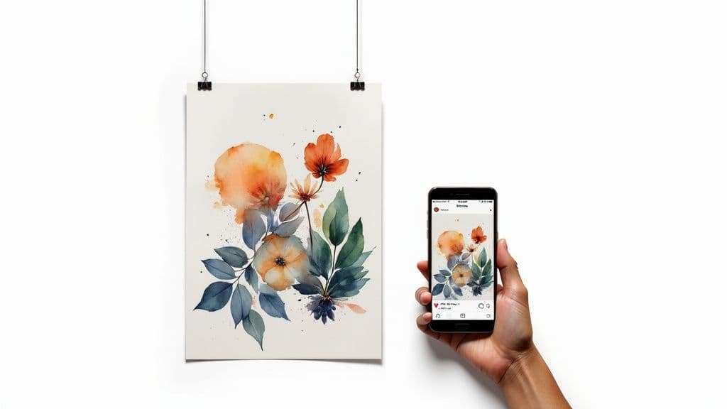
So you’ve created an amazing sales poster. Great! But why let it live only on a wall? That design is pure gold, and it's time to let it shine online.
With Instastock, you can jump straight from your finished poster file into crafting a whole suite of social media assets. It's surprisingly quick.
The magic starts with exporting your poster art in the right format. Inside Instastock, the "one-click transform" feature is your best friend. It lets you resize everything for different platforms without turning your beautiful design into a blurry mess. In seconds, you can have versions ready for Instagram Stories, Facebook carousels, or even animated banners.
Each social platform has its own quirks, so a one-size-fits-all approach won't cut it. You need to tweak your layout for each format.
As digital marketer Lucy James once told me, "Repurposing print designs for social cut our production time by 50% and boosted reach by 2.4×." It’s a no-brainer.
The key to making this work is consistency. Stick to your core colour palette and fonts. People scroll fast, and you want them to instantly recognise your brand, whether they see your poster in a shop window or in their feed.
Want to really stop the scroll? Add a touch of motion. Turning your static poster into a simple animation is easier than you think.
I saw a local cafe do this recently. They turned a simple poster into a GIF that pulled in 73% of all their user interactions on Instagram that week. It works.
For a deep dive into the nitty-gritty of sizing for every network, our guide on social media image dimensions has you covered.
Finally, think about how these assets fit into your content calendar. You can tease an upcoming sale with a countdown on an Instagram Story, then follow up a few days later with a carousel that shows off the different products on offer. By mixing up the formats, you keep your audience engaged without having to design everything from scratch.
A London-based streetwear label I know turned their A2 poster into a five-frame Facebook carousel. It was a simple shift, but the results were stunning: they saw a 180% uplift in link clicks and a 25% boost in sales from that one campaign.
Repurposing your poster isn't just a time-saver. It’s a smart way to make your campaign work harder, cementing its message across the physical world and the digital feeds where your customers spend their time.
You’re not alone. When you get to the nuts and bolts of creating a sales poster, a few common questions always seem to pop up. Let's tackle them head-on so you can get your design out the door with confidence.
This is the million-dollar question, isn't it? It feels a bit like throwing a message in a bottle, but you can absolutely track a physical poster's impact. The trick is to give people a unique reason to act right from the poster.
Think about including a special offer that only exists on that print. For instance, you could add a discount code like "SALEPOSTER15" or a QR code that zips people over to a dedicated landing page. Then, it's just a matter of counting how many times that code was redeemed or how much traffic that page received. That’s your hard data, right there.
The paper you choose really does change how people perceive your offer. It's the difference between "ooh, nice" and "meh." For most indoor posters, a 170gsm silk or gloss paper is a solid, professional choice. It gives your colours a lovely vibrancy without a distracting glare.
If your poster is going to be braving the great outdoors or placed in a busy corridor, you'll want something tougher. Stepping up to a thicker 250gsm stock or even a synthetic, weather-resistant paper will ensure it holds up.
Choosing the right paper isn't just a technical detail; it’s part of the customer's experience. A quality feel suggests a quality product.
Yes, one hundred percent. This is a big one. Grabbing a random image from the internet for your poster for sales can land you in a world of legal trouble and hefty fines. It's always safest to assume every image is copyrighted unless you know for sure it isn't.
Ready to create stunning, fully-owned visuals for your next campaign without ever worrying about licensing again? With Instastock, you can generate the perfect image in seconds. Try Instastock for free and see the magic for yourself.
Master how to crop image in illustrator with simple steps, masks, artboards, and Pathfinder tips for clean, precise results.
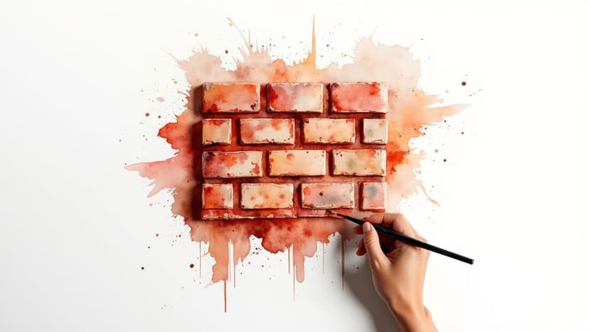
Learn how to create a flawless bricks texture seamless design using AI. Our friendly guide has actionable tips for realistic, tileable patterns.
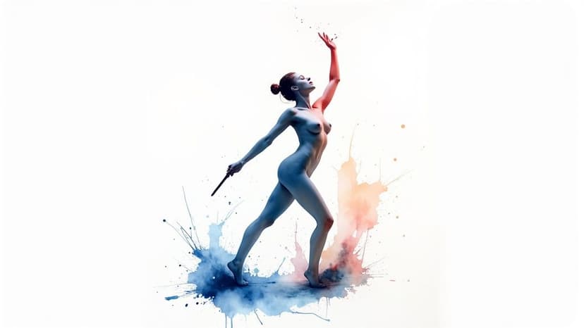
Learn to design, customize, and use a unique body outline template with AI. Our guide offers practical tips for artists, designers, and creators.