black and white logos: 8 Striking Styles to Inspire in 2025
Discover 8 striking black and white logos styles that prove bold contrast can elevate any brand. Find ideas, tips, and timeless design inspiration.
November 12, 2025•14 min read
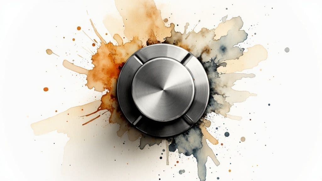
Learn how to create a realistic brushed metal texture. Our guide covers Photoshop, Blender, and AI methods for designers and 3D artists.
Instastock Team
November 13, 2025 • 14 min read
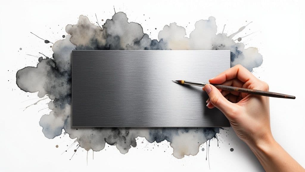
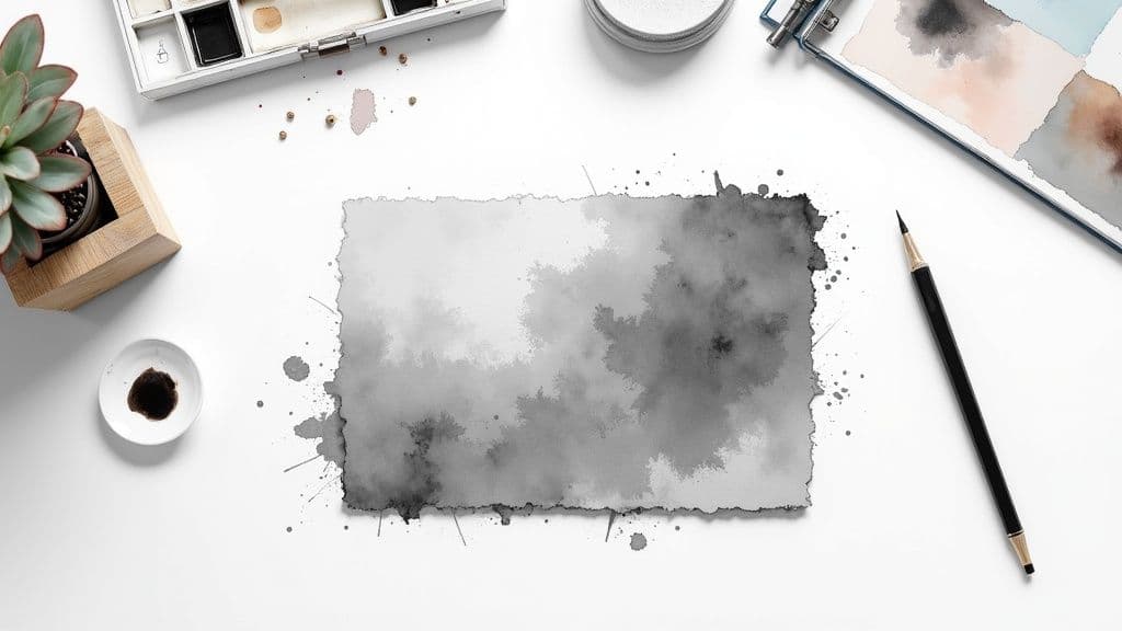
A brushed metal texture is all about creating the look of a surface that’s been finished with a wire brush. You’ll recognise it by its fine, parallel lines. It’s a hugely popular choice in digital design, bringing a touch of sophistication and realism to everything from product mockups to architectural visualisations.
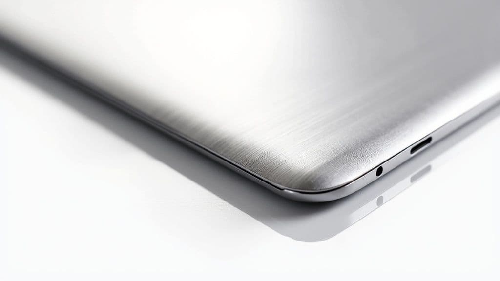
Before we dive into the how-to, it’s worth taking a moment to appreciate why this texture is so effective. A brushed metal finish isn't just a pretty effect; it’s a design tool that sends a specific message to your audience. Its subtle, one-directional grain plays with light in a way that flat colours just can't, giving you a dynamic surface that feels both premium and tangible.
This is what adds that extra layer of depth and authenticity, instantly making a design feel higher quality. Just think about high-end kitchen appliances, luxury car interiors, or top-tier electronics – they all use brushed metal to suggest durability and a clean, modern style.
Beyond just looking good, brushed metal textures serve a very practical purpose, both in the real world and in our digital creations. The linear pattern is fantastic for hiding minor imperfections like fingerprints, smudges, and tiny scratches. This clever bit of functionality has made it a go-to in industrial design for years.
Here in the UK, the fabricated metals industry has seen a steady rise in demand for these kinds of finishes. Mechanically finished surfaces, including brushed textures, are often chosen for their perfect blend of style and toughness. In fact, a report on fabricated metals in the United Kingdom shows that over 60% of stainless steel products now feature some kind of mechanical finish, thanks to a bigger focus on sustainable, long-lasting materials.
When you get this texture right, you gain the power to make digital objects look more solid, more expensive, and far more realistic. It’s a core skill for anyone working in product visualisation or branding.
Knowing how to create and apply a believable brushed metal texture is a game-changer. It can be the one thing that turns a flat, boring graphic into a compelling visual that grabs attention. Whether you’re building assets from the ground up or just giving existing images a boost, this texture adds a truly professional touch.
These skills are especially crucial when you learn how to create mockups, where realism is the name of the game.
Right then, let’s get our hands dirty and build one ourselves.
Sometimes, the tried-and-true methods are still the best. While newer AI tools are fantastic for quick results, nothing gives you the same degree of hands-on control as building a texture from scratch in Photoshop. Let's roll up our sleeves and create a realistic brushed metal texture from a blank canvas.
The secret here isn't about complex plugins; it's all about layering simple, core effects to build something that looks incredibly detailed and authentic. We’ll start by creating the base grain and then mould it into that classic linear pattern.
First up, let's get our document ready. A canvas of 2048x2048 pixels is a great, versatile size to work with. Go ahead and fill the background layer with a neutral, mid-tone grey—I find #808080 is a perfect starting point for a metallic base. We can always adjust the colour later on.
Now for the key ingredient: noise. This is the raw material we'll be shaping into those fine brushed lines. To get started, navigate to Filter > Noise > Add Noise.
This is where you'll define the initial roughness of the metal. Here are the settings I typically use:
Right now, your canvas probably looks like old TV static. It’s not much to look at yet, but trust the process. This noisy layer is exactly what we need for the next step.
This is where the magic really starts to happen. We're going to take that random, static-like noise and stretch it out into the distinctive parallel lines of a brushed finish. The perfect tool for this is the Motion Blur filter.
Make your way over to Filter > Blur > Motion Blur. You'll see a dialogue box with two crucial sliders: Angle and Distance. These are what give you control over the direction and intensity of the brushing.
The Angle simply dictates the direction of the brush strokes. A setting of 0 degrees creates horizontal lines, which is a classic look, while 90 degrees will give you vertical lines. You can, of course, pick any angle in between to match the surface you're aiming for.
Next, the Distance setting controls how long and defined the streaks are. Think of it like this:
Play around with the Distance slider until the texture has the character you're after.
A little pro tip from me: always convert the layer to a Smart Object before you apply the Motion Blur. This keeps the filter non-destructive, which means you can easily double-click it later to tweak the Angle or Distance without having to undo everything and start again.
Okay, so we've got the linear pattern down, but it still looks pretty flat and lifeless. To really sell that metallic look, we need to introduce some highlights and shadows. The best way to do this without permanently changing our texture is with a Curves adjustment layer.
Head to Layer > New Adjustment Layer > Curves. This will pop a new layer into your stack. Inside the Curves panel, you're going to create a gentle "S" shape. Just click on the diagonal line to add two points—one in the upper-right quadrant for the highlights and another in the lower-left for the shadows.
Gently drag the top point up to brighten the highlights and pull the bottom point down to deepen the shadows. This boost in contrast is what makes the tiny grooves of the texture catch the light and feel truly three-dimensional. Even a tiny adjustment here can make a world of difference.
For any 3D artist, the moment you move beyond slapping a static image onto a model is a game-changer. This is where procedural textures come in. Built directly inside your software, whether it's Blender, Substance Painter, or something similar, they offer an incredible amount of freedom. Because they're based on maths, not pixels, they can scale infinitely without losing an ounce of quality and can be tweaked in real-time.
Let's walk through building a dynamic and realistic brushed metal texture using a node-based workflow. The great thing about this approach is that once you grasp the core ideas, you can remix them to create endless variations.
First things first, you need to set up a proper metallic base. This is more than just picking a grey colour; you're fundamentally telling the render engine to treat this surface like a piece of metal. In most modern PBR (Physically Based Rendering) shaders, it’s as simple as creating a new material and pushing the Metallic slider all the way to 1.0.
Once that's done, you can play with the Base Colour to define what kind of metal you're making. A light grey is perfect for steel or aluminium, while a warmer yellow or orange hue will give you a convincing gold or brass. For now, a simple mid-grey will do nicely – it’s the perfect canvas for what comes next.
Now for the fun part: faking those fine, parallel grooves. The secret is to generate a basic noise pattern and then stretch it out in one direction. Your best friend for this task is a Noise Texture node.
Of course, a standard noise pattern on its own just looks like a fuzzy cloud. The trick is to manipulate its coordinates to create that linear effect. To pull this off, you'll need a Texture Coordinate node feeding into a Mapping node. By cranking up the Scale value on a single axis (like X or Y), you can squash and stretch the noise into long, thin streaks.
This stretched noise pattern is the heart and soul of the entire texture. It's the visual data we'll feed into the other shader properties to mimic how a real brushed surface plays with light.
The real magic of procedural workflows is non-destructive iteration. You can go back and change the noise scale, rotation, or even the type of noise at any point, and the whole texture updates instantly. You're building a flexible system, not just painting a static image.
At this point, we have a pattern, but the surface still reflects light like a clean mirror. To make it believable, we need to tell the renderer where the surface is rougher (within the tiny grooves) and where it’s a bit smoother.
Take the output of your stretched noise pattern and connect it to the Roughness input of your main shader. You'll almost always want a Colour Ramp node in between to fine-tune the contrast. This is how you control how matte or shiny the streaks are, which is absolutely vital for realism.
To really sell the effect, plug that same pattern into a Bump node, which then gets connected to the Normal input of your shader. This fakes microscopic shadows and highlights along the grooves, giving the surface a physical depth you can almost feel.
As you get more comfortable, exploring specialized 3D texture tools like Polycam can seriously speed up and enhance your workflow for creating complex materials.
The final, crucial touch is getting that signature stretched highlight that screams "brushed metal." This effect is called anisotropy, and it's what happens when light reflects differently based on the grain of a surface.
Somewhere in your main shader, you should find an Anisotropic parameter. Increasing this value tells the shader to stretch reflections in a specific direction. You'll also need a Tangent node to control the direction of that stretch, making sure it lines up perfectly with the brushed lines you created earlier. This is the last piece of the puzzle that truly sells the illusion.
To help you get started, here's a quick cheat sheet for the most important parameters in a typical PBR shader setup for this effect.
| Parameter | Function | Recommended Starting Value |
|---|---|---|
| Metallic | Tells the renderer to treat the surface as a metal. | 1.0 (non-metals are 0.0) |
| Roughness | Controls how diffused or sharp reflections are. | Use your stretched noise texture here. |
| Noise Scale (Mapping) | Determines the density and fineness of the brush lines. | X: 50.0, Y: 1.0 (or vice versa) |
| Normal/Bump Strength | Controls the perceived depth of the brushed grooves. | 0.05 - 0.2 (a little goes a long way) |
| Anisotropy | The amount of stretching applied to reflections. | 0.5 - 0.8 |
| Anisotropic Rotation | The direction of the stretched reflection. | Align with your brush direction (e.g., 0.25 for vertical lines). |
These values are just a starting point, of course. The best results come from tweaking and experimenting until the material feels right for your specific scene and lighting. Happy texturing
It's impossible to ignore how much artificial intelligence is shaking up the creative world, and texture generation is a prime example. With tools like Midjourney and Stable Diffusion, you can conjure up an almost endless stream of unique, high-quality textures in just a few moments. When you're on a tight deadline and need a specific brushed metal texture right now, AI can honestly feel like a superpower.
The real magic with these platforms isn't about knowing some complex software inside and out; it's all about mastering the art of the prompt. Your words are the direct instructions guiding the AI, and tiny tweaks can produce wildly different results. Getting specific is your best friend for coaxing out the exact image you have in your head.
Think of yourself as a director giving very precise instructions to an artist. Just asking for a "metal texture" is too vague. You need to guide the AI with descriptive details to get a usable asset.
I’ve found that a solid prompt nearly always includes a few key ingredients:
brushed metal texture. But don't stop there. Is it brushed aluminium, dark brushed steel, or maybe brushed bronze? Every metal has its own distinct colour and shine.fine horizontal linear strokes, coarse vertical brushing, or subtle circular brushed pattern. This tells the AI exactly how the metal was "finished."soft studio lighting, dramatic side light, or even, flat lighting will completely transform the mood and define how highlights and shadows fall across the surface.photorealistic, seamless, 4K, or macro detail to really push the quality and nail the style you're after.The secret to getting great results from AI is all about iteration. Your first prompt is almost never your last. Start with a good foundation, see what the AI spits out, and then refine your prompt by adding, removing, or changing keywords based on that initial image.
If you want to go a bit deeper into crafting effective prompts, our guide on how to generate images with AI is a great resource that applies just as well to texture work.
Let’s look at a couple of real-world examples to see just how much a few extra words can change the outcome.
Example 1: The Basic Prompt
brushed metal texture, grey
This is just too simple. You'll likely get a generic, flat-looking image that's missing any real detail or convincing play of light. Sure, it might look vaguely metallic, but it won't feel real.
Example 2: The Detailed Prompt
dark brushed steel texture, clean horizontal linear strokes, soft studio lighting, macro detail, photorealistic
Now we're talking. By specifying the metal (dark brushed steel), the brush direction (horizontal), and the lighting (soft studio), you’re giving the AI clear, actionable instructions. The result is going to be a far more specific and believable brushed metal texture that you can actually use.
Using AI for textures isn't here to replace manual methods, but it's a seriously powerful alternative with its own pros and cons.
The most obvious win is speed. You can generate dozens of different options in the time it would take to build a single texture from scratch in Photoshop. This is incredible for brainstorming, whipping up concept art, or just hitting those impossible deadlines.
On the flip side, the biggest drawback is control. As powerful as prompts are, you just don't get the same pixel-perfect precision that comes from creating something by hand. Getting a perfectly seamless, tileable texture can also be a bit of a gamble and often requires a final touch-up in another program.
We're seeing AI pop up in all sorts of creative fields; for instance, many are now using AI product photography for fashion brands to create amazing visuals without a physical photoshoot, which just shows how versatile this tech is. For designers, it’s really about picking the right tool for the job—sometimes speed is everything, and other times, absolute control is the only thing that matters.
Getting that base brushed pattern down is a massive win, but the real magic happens in the details. This is where we elevate a good texture into a great one. A perfectly clean, flawless brushed metal texture just screams "computer-generated". To really sell the realism, we need to add the kind of subtle imperfections you'd find on any real-world surface.
Just look around you. Metal surfaces are magnets for fingerprints, faint smudges, and a light dusting of grime. We can mimic this in Photoshop with some clever layering. Try using a soft, low-opacity custom brush to paint in some subtle smudges, or even better, layer a photographic "grunge" texture over your metal. Set the blend mode to Soft Light or Overlay, and you'll find even the slightest hint of imperfection adds a huge amount of character and breaks up that sterile uniformity.
That standard grey texture is a fantastic starting point, but why stop there? With a couple of simple adjustment layers, you can transform it into all sorts of different metals. The best part is that this approach is completely non-destructive, meaning you can whip up multiple variations from one base texture.
Here are a few quick recipes I use all the time:
Of course, not all brushed metal is a straight line. Think about the back of a watch, a high-end volume knob, or a camera lens mount—they often have that gorgeous circular or radial brushed finish. It looks complicated, but it's surprisingly simple to create in Photoshop.
Grab your noisy, pre-blurred texture from the earlier steps. This time, instead of using Motion Blur, head over to Filter > Blur > Radial Blur. Set the method to Spin, and just crank up the amount until those pixels streak into a smooth, circular pattern. It's a fantastic trick that adds a seriously professional touch to any circular element in your designs.
The real acid test for any texture, especially if it’s for 3D work or large backgrounds, is whether it can tile seamlessly. A visible seam is an instant immersion-breaker, drawing the eye and shattering the illusion of a continuous surface.
Making a texture tileable is a non-negotiable skill. My favourite method is to use Photoshop's Offset filter (Filter > Other > Offset). By shifting the image exactly halfway on both axes, it brings the edges right into the centre, making any seams glaringly obvious. From there, it's just a matter of using the Clone Stamp or Healing Brush to blend those edges away. It's a must-know technique, and it applies to all sorts of materials, as we cover in our guide to making a seamless concrete texture. Get this right, and your assets will be ready for anything.
Even with the best guide, you'll likely hit a snag or two when trying to perfect your brushed metal texture. It happens to everyone. Let's walk through some of the most common issues I see people run into and how to fix them.
A big one is getting the shine just right. If your metal looks more like dull plastic, the problem is almost always a lack of contrast. You need those bright highlights and deep shadows to sell the effect of light hitting the grooves. My first port of call is always a Curves or Levels adjustment layer – don't be shy about pushing those values.
Then there's the opposite problem: a texture that looks too perfect, almost sterile. Real-world metal has character; it's got tiny scratches, faint smudges, and a bit of history. An easy trick I use all the time is to overlay a subtle grunge map. Just drop the opacity way down, set the blend mode to Overlay, and watch your texture come to life.
Ah, the dreaded pixelation. If your brushed metal looks blocky, especially when you've built it up from scratch in Photoshop, the culprit is almost certainly your canvas size. Starting with a small canvas, say 512x512 pixels, and then scaling it up is a recipe for disaster. You're just stretching a small amount of information too thin.
My rule of thumb? Always start bigger than you think you need. I'd suggest a canvas of at least 2048x2048 pixels. This gives you so much more detail to play with and ensures those fine, brushed lines stay sharp, even when you apply the texture to a large 3D model or a high-resolution background.
This is a great question, and the answer is... sort of. While you can certainly add prompts like seamless or tileable to your AI generator, the results can be hit-or-miss. AI doesn't always understand the concept perfectly, often leaving you with visible seams or patterns that just don't repeat correctly.
The best workflow I've found is a hybrid one. I use the AI to do the heavy lifting – generating a beautiful, high-resolution texture to start with. Then, I bring that image into Photoshop and use the classic Offset filter to manually clean up the seams. It's the perfect blend of AI speed and human precision, and it gets me fantastic, truly seamless results every single time.
Ready to create stunning, unique visuals for your projects without the hassle of traditional stock photography? Instastock lets you generate any image you can imagine with AI, giving you full ownership and unlimited creative freedom. Try Instastock for free and create your first five images today.
Discover 8 striking black and white logos styles that prove bold contrast can elevate any brand. Find ideas, tips, and timeless design inspiration.
Discover the best fonts for posters and how to pick standout type for print. Top 7 picks and where to find them.
Searching for high-quality pictures to print? Discover the 7 best online sources for wall art, photos, and unique images, complete with print tips.