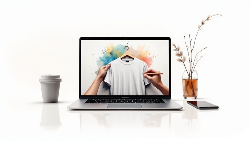
How to Create Mockups That Impress Your Clients
Learn how to create mockups that win projects. This guide covers planning, tool selection, and presentation tips for designers.
November 2, 2025•13 min read
Learn how to design a poster that captivates your audience. Our guide covers core principles, from layout and typography to color, imagery, and printing.
Instastock Team
October 26, 2025 • 13 min read
Before you even think about fonts or colours, every great poster starts with two simple questions: *What’s its job, and who is it for?
Everything else you do hinges on these two answers. Get this foundation right, and the design decisions that follow become much, much clearer.

It's tempting to jump straight into the fun part—the creative design. But hold on for a moment. A poster without a clear purpose is just a pretty picture; an effective poster is a powerful communication tool that gets results.
Your very first task is to nail down its single most important goal. Is it to drive ticket sales for a local music festival? Announce a flash sale in your shop? Or maybe raise awareness for a community bake sale? This primary objective is your North Star, guiding every choice from the headline down to the call to action.
Think of your poster's goal as its job description. A tight focus stops your message from becoming muddled or, even worse, completely ignored. Most posters fall into one of these camps:
A poster has to land its main message in seconds. If someone walking past can't instantly grasp what it's about, the design has failed. A clear goal ensures you achieve that immediate clarity.
Once you know what you’re saying, you need to figure out who you're saying it to. A poster designed for freshers' week will look and feel completely different from one aimed at corporate executives in the City.
Ask yourself a few key questions about your audience:
Nailing down these details is crucial. A great way to formalise your thinking is by creating a design brief. If you're not sure where to start, our guide on design brief templates can give you a brilliant head start.
For a deeper dive into making your visuals truly connect with people, it's also worth exploring these expert design strategies for maximizing visual impact. This initial planning is a massive part of the UK’s specialised design activities market, which is valued at around £9 billion. That figure alone shows how much demand there is for visuals that don't just look good but actually work.
See how your poster's main objective directly influences key design choices. Use this as a quick reference before you start designing.
| Poster Goal | What to Emphasize First | Common Tone | Suggested Visual Style |
|---|---|---|---|
| Sell Tickets | Event Name, Headline Act, Date | Exciting, Urgent | Bold, dynamic, high-energy visuals |
| Announce a Sale | The Discount (50% OFF!) | Direct, Compelling | Eye-catching, simple, strong typography |
| Inform the Public | Key Information (What, Where, When) | Clear, Authoritative | Clean, structured, highly readable |
| Promote a Cause | The Core Message or Statistic | Emotional, Inspiring | Evocative imagery, powerful colours |
This table is a great starting point, but remember to always tailor these elements to your specific audience for the best results.
A great poster doesn’t make you work to figure out its message. It should be a visual tour guide, pulling your eye exactly where it needs to go in just a few seconds. This effortless journey is all down to a strong visual hierarchy—the art of arranging things to show what’s most important.

The easiest way to get this right is with scale. Your headline needs to be the biggest, boldest thing on the page. No exceptions. It’s the hook that reels people in. Supporting details—like the date, time, and location—can be smaller, with the least critical info being the smallest of all.
This simple trick creates a clear path for the eye, making sure your main message lands almost instantly. Contrast does a similar job. Stick a bright, vibrant colour next to something muted, and you’ve created a focal point that demands to be seen.
While there are no hard-and-fast rules, a few tried-and-tested layout patterns can give your design a solid foundation. Think of these as frameworks, not formulas, so feel free to bend them to fit what you’re trying to do. They just help give your poster a more organised, professional feel.
The Z-Path: People who read English (and many other Western languages) naturally scan from top-left to top-right, then diagonally down to the bottom-left, and finally across to the bottom-right. If you place your key elements along this “Z” shape, you’re working with this habit, not against it. Pop your headline at the top, a key image in the middle, and your call to action in that bottom-right corner.
The Rule of Thirds: Picture your poster divided by a 3x3 grid, like the one on your phone's camera. The rule of thirds suggests placing your most important elements along these lines or where they cross. It’s a simple way to create a more dynamic and visually interesting layout than just plonking everything in the centre.
These patterns are fantastic starting points, but honestly, the best designs often know when to break the rules for a bit of drama. A single, massive, centrally-placed image can be incredibly powerful if you're going for pure emotional impact. You’ve got to know the rules before you can break them effectively.
One of the most overlooked yet critical tools in any designer’s kit is white space. And no, it’s not just "empty" space—it’s an active element that gives your design room to breathe. Jamming your poster full of text and images is the quickest way to overwhelm your audience and make them look away.
White space is what separates a cluttered, confusing design from a clean, high-impact one. It reduces cognitive load, improves readability, and makes your key elements pop.
Think of it like pausing in a speech. Those moments of silence give weight to what was just said. In the same way, surrounding your headline or a key image with plenty of white space gives it more importance. It signals to the viewer, "Hey, look here. This is important." Don't be afraid to be generous with it; a little emptiness can make your poster feel far more confident and professional, ensuring your message is actually seen and understood.
Think of the fonts you choose as your poster's voice. They can shout about a music festival, whisper elegantly about a gallery opening, or state facts with quiet authority for an academic conference. Typography isn’t just about making words legible; it’s about injecting them with personality.
One of the most common pitfalls I see is designers throwing too many fonts at a poster. This almost always ends up looking cluttered and amateurish. A good rule of thumb? Stick to two, or at the absolute most three, complementary fonts. This gives you enough contrast to guide the eye without creating a visual mess.
Your fonts need to have different jobs. The headline font is your lead actor—it needs to be bold, charismatic, and grab all the attention. This is the perfect place to use a more decorative or unique display font.
For your supporting cast—subheadings and body text—readability is everything. You can almost never go wrong with a clean, simple sans-serif font like Helvetica or Lato for the nitty-gritty details like dates, locations, and websites. They’re built to be read easily, even from across a room. Serif fonts, the ones with the little "feet" like Garamond or Times New Roman, can bring a sense of tradition, sophistication, or authority, which makes them a great fit for more formal events.
Here’s a simple, practical way to pair them up:
This approach creates a unified feel while making it crystal clear what information is most important.
The vibe of your font has to match the vibe of your event. A playful, rounded font might be perfect for a kid's bake sale, but it would feel jarring on a poster for a corporate law firm.
Imagine these scenarios:
Your font choice is a shortcut to setting the right emotional tone. Before anyone even reads a word, the style of the text is already telling them what to expect. Make sure it’s telling the right story.
It's also worth keeping an eye on visual trends. What looks fresh and current? We’re seeing a big push towards minimalism and bold typography, often paired with more natural, organic elements. This is where AI tools are really starting to shine, helping designers find great font pairings quickly and freeing them up to focus on the bigger creative picture. You can dive deeper into the latest trends in the UK design industry to see where things are headed. Ultimately, when you're learning how to design a poster, remember that choosing your fonts is a strategic move, not just a decorative finishing touch.

Before anyone even reads your poster, they feel it. That immediate emotional hit comes straight from your colour and imagery choices. Get them right, and you've got someone's attention from across the street. Get them wrong, and your poster may as well be invisible.
Your colour palette is doing some serious heavy lifting here—it’s a psychological shortcut to your message. Colours aren't just for decoration; they're your primary tool for setting the mood.
Let’s think practically. A summer music festival poster just screams for warm, vibrant colours. You'd instinctively reach for energetic oranges, yellows, and hot pinks to telegraph fun and excitement. On the other hand, if you're designing for a serene yoga retreat, you’d want to create a sense of calm with cool blues, gentle greens, and muted, earthy tones. The colours do the work before the words do.
A powerful palette doesn't have to be complicated. In fact, some of the most memorable posters I’ve seen stick to just two or three carefully chosen colours. This creates a bold, cohesive look that’s hard to ignore. High-contrast pairings—think a zesty yellow on a deep navy blue—are brilliant for making a design pop and ensuring it’s legible from a distance.
Here are a few classic strategies that always work:
It's worth remembering that 61% of viewers find posters a good way to discover new events or local businesses. Your colour choice is the first impression that makes that discovery worthwhile.
Don't be afraid to break the rules, though. Sometimes an unexpected colour combination is precisely what you need to cut through the noise. This is where Instastock’s AI can be a massive help. You can simply ask it to generate palettes based on a vibe, like "optimistic and professional" or "edgy and urban," and see what it comes up with. It’s a great way to jumpstart your creativity.
A single, powerful image can say everything you need to say in a heartbeat. It’s not just about filling empty space; it’s about telling a story and forging a connection that makes your poster stick in someone's mind. The trick is to find a visual that amplifies your message, rather than fighting it for attention.
Your image should be the star of the show, but it needs to support your headline. If you're creating a poster for a local coffee shop, a beautifully shot, close-up photo of steaming latte art is far more enticing than a generic picture of the building. You’re showing the experience, not just telling people where to go. For more on this, our guide on what is visual storytelling has some fantastic pointers.
Ultimately, whether you land on a stunning photograph or a clever illustration, make sure it’s high-quality and directly relevant. Nothing undermines a great design faster than a blurry, pixelated, or random image. Again, AI tools are a game-changer here. You can generate a completely unique, high-resolution image that perfectly captures the specific mood you're after, ensuring every single element of your poster is pulling in the same direction.

The creative work might be done, but we're not quite at the finish line yet. This last stage is what truly separates a professional poster from an amateur one.
Prepping your design file for its final destination—whether that’s a physical print run or a digital screen—is absolutely non-negotiable. It’s a bit like the final quality check before a product leaves the factory. Get these technical details wrong, and all your hard work could be undone by muddy colours or blurry images.
When your poster is destined for the physical world, precision is everything. Printers play by a different set of rules than digital screens, and you need to get these settings spot-on before you send anything their way.
Your number one priority has to be resolution. For any professional printing, your file must be set to 300 DPI (dots per inch). This is the gold standard for high-quality, crisp visuals. Don't be tempted to design at a lower resolution and scale it up later—it just doesn't work. You’ll be left with a pixelated mess.
Next up, your colour mode needs to be CMYK (Cyan, Magenta, Yellow, Key/Black). This is the four-colour model that all commercial printers use. If you’ve designed in RGB (the standard for screens) and just export for print, the colours will shift, often looking much duller than you expected.
Finally, don't forget the bleed! This is simply a small extra margin you add around the edges of your design. When the printer trims the posters down to size, this bleed ensures your artwork goes right to the very edge, leaving no unsightly white borders. Most printers will ask for a 3mm to 5mm bleed.
Taking a few minutes to set up your file correctly for print will save you the frustration—and expense—of a disappointing print run. It’s a small technical step that makes a world of difference.
If your poster is headed for social media, a website, or an email campaign, your priorities change completely. Here, the game is all about vibrant colours and a file size that loads in a flash.
For any kind of digital use, you'll need to work in the RGB (Red, Green, Blue) colour mode. This colour space is specifically designed for screens and produces the bright, vivid colours we’re all used to seeing online. Using CMYK for a digital poster will only make it look flat and lifeless.
The resolution standard for the web is much lower, typically 72 DPI (dots per inch). This keeps the file size nice and small, which is crucial for fast loading times on websites and social feeds. After all, nobody wants to wait around for a huge image to load.
For more practical advice on this, check out our guide on how to reduce the file size of photos without losing quality.
Getting your head around these two different worlds can be tricky at first. This little table breaks down the essentials to help you avoid common export errors.
| File Setting | For Print | For Digital Screens |
|---|---|---|
| Colour Mode | CMYK | RGB |
| Resolution | 300 DPI | 72 DPI |
| Key Priority | Image Sharpness | File Size |
| Extra Margin | 3-5mm Bleed | Not Required |
Hopefully, that clears things up! Knowing which settings to use and when is a fundamental skill for any designer.
Despite the digital boom, it's worth remembering that print posters remain a vital part of the UK’s $2.48 billion (USD) graphic design market. Their enduring impact really shows the power of well-executed physical media in a crowded online space. You can discover more insights about the European graphic design market to see the full picture.
Even with the best plan in the world, you’re bound to hit a few snags or second-guess a decision. It happens to all of us. Getting stuck is just part of the creative process, but staying stuck doesn't have to be.
Here are the answers to some of the most common questions I get asked about poster design. Think of this as your go-to guide for those tricky moments, helping you push past the roadblocks and create something you're proud of.
Hands down, it's visual hierarchy. You’ve got maybe three seconds to grab someone's attention as they walk by. If they can't instantly see what your poster is about—the name of the band, the can't-miss sale, the main event—then it's just a pretty picture that isn't doing its job.
Your headline and main image need to be the undeniable heroes. Everything else, like the date, time, and location, should be easy to find but shouldn't compete for the spotlight. A solid hierarchy is the secret sauce that makes a poster effective, not just decorative.
Stick to the "less is more" philosophy here. The golden rule is to use no more than two or three fonts. This gives you enough room to create contrast and guide the eye, but it stops things from looking chaotic and unprofessional.
A tried-and-true combo is a bold, punchy font for the headline paired with a clean, super-readable sans-serif for the details. Another great trick is to just use one versatile font family and play with different weights—bold for the title, regular for the body, and light for secondary info. It keeps everything looking clean and related.
Remember, the purpose of a conference poster is to catch people’s attention from across a room and make them want to talk to you. Limiting your font choices helps achieve that clarity instantly.
This one is non-negotiable: 300 DPI (dots per inch). For anything you plan to print professionally, this is the industry standard. It’s what ensures your text is sharp and your images are crisp, not a blurry, pixelated mess.
The critical thing is to set this up right at the start, when you first create your file in your design software. You can't just design at a low web resolution like 72 DPI and scale it up later—the quality will be lost for good. When in doubt, always go with 300 DPI for print.
They absolutely can be, but you have to be picky. Steer clear of those cringe-worthy, generic shots of people in suits high-fiving. We've all seen them, and they scream "stock photo." Look for images that feel authentic and genuinely align with the mood you're trying to create.
Of course, custom photography is always best, but AI image generators are changing the game entirely. They let you cook up completely original visuals just by typing a description. If you're looking for inspiration on how to get started, resources with AI-powered poster design prompts can really help get the creative juices flowing.
Ready to create stunning, unique visuals for your next poster without the hassle of stock photo licences? With Instastock, you can generate any image you can imagine in seconds, refine it with simple text commands, and own it completely. Get your first five images for free at https://instastock.studio.
Learn how to create mockups that win projects. This guide covers planning, tool selection, and presentation tips for designers.
What is omnichannel marketing? Learn how to build a seamless customer experience that drives loyalty and growth for your UK business with this practical guide.
Your complete guide to social media image dimensions. Get the latest sizes and best practices for Instagram, Facebook, X, and LinkedIn to optimize your content.